


Case study
Finestro: a learning path users want to finish
I researched how game mechanics keep people learning, ranked them by their impact on the product and redesigned the personal learning plan: from a list of units to a gamified, step-by-step path in the spirit of Duolingo. After the release, retention and lesson completion rose by 23%.
My role
Product Designer
Methods
Competitive analysis / Research on gamification / Ranking mechanics by impact / UI redesign
Goal
- More users coming back to their plan
- More lessons completed
Result
+23% retention and lesson completion
- +23%
retention and lesson completion after the update
- 8
gamification mechanics ranked by impact before design
- 4
interface features, from progress to the next course
- 2
platforms with one path: web and app
Stage 1 · The problem
A plan that read like a list
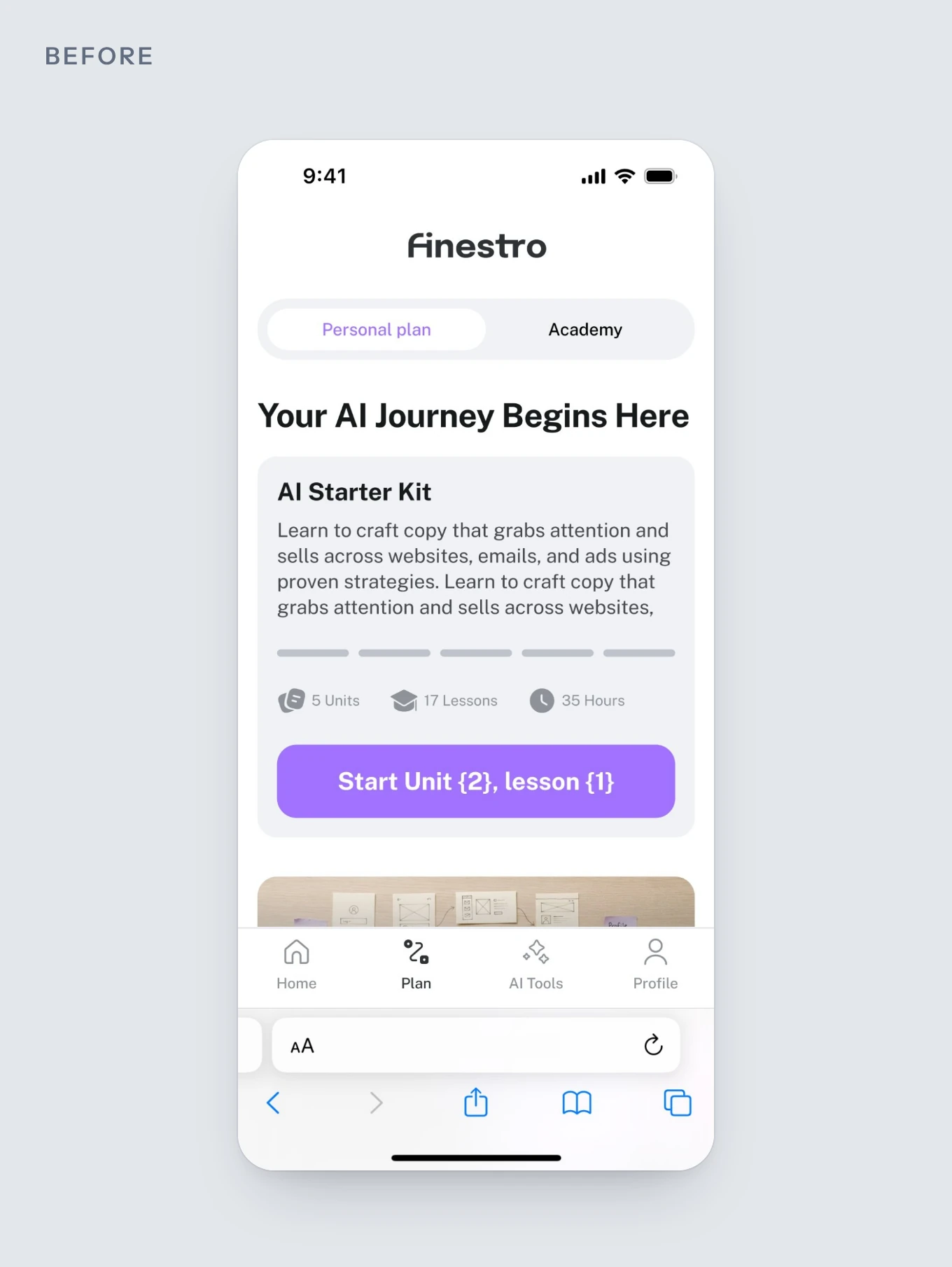
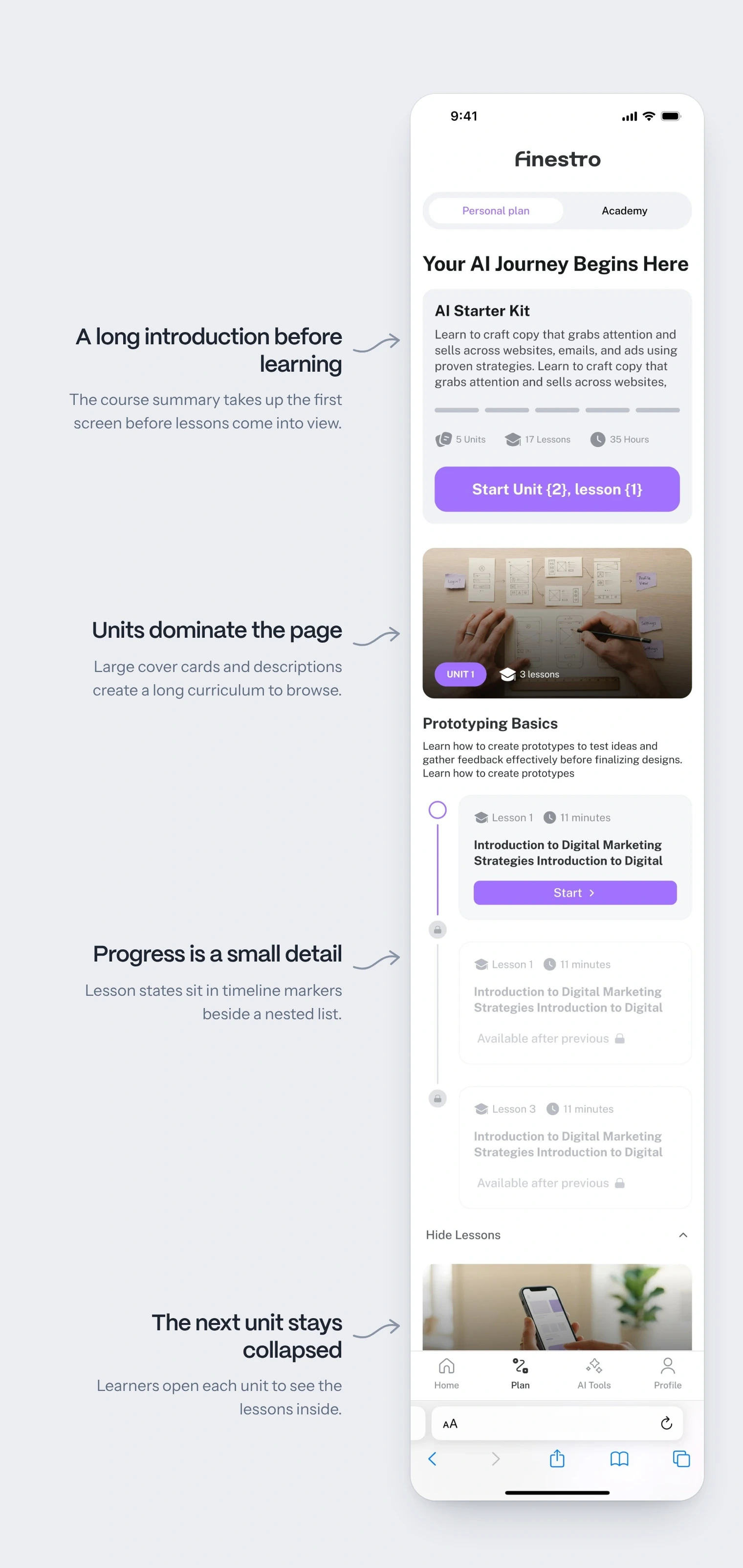
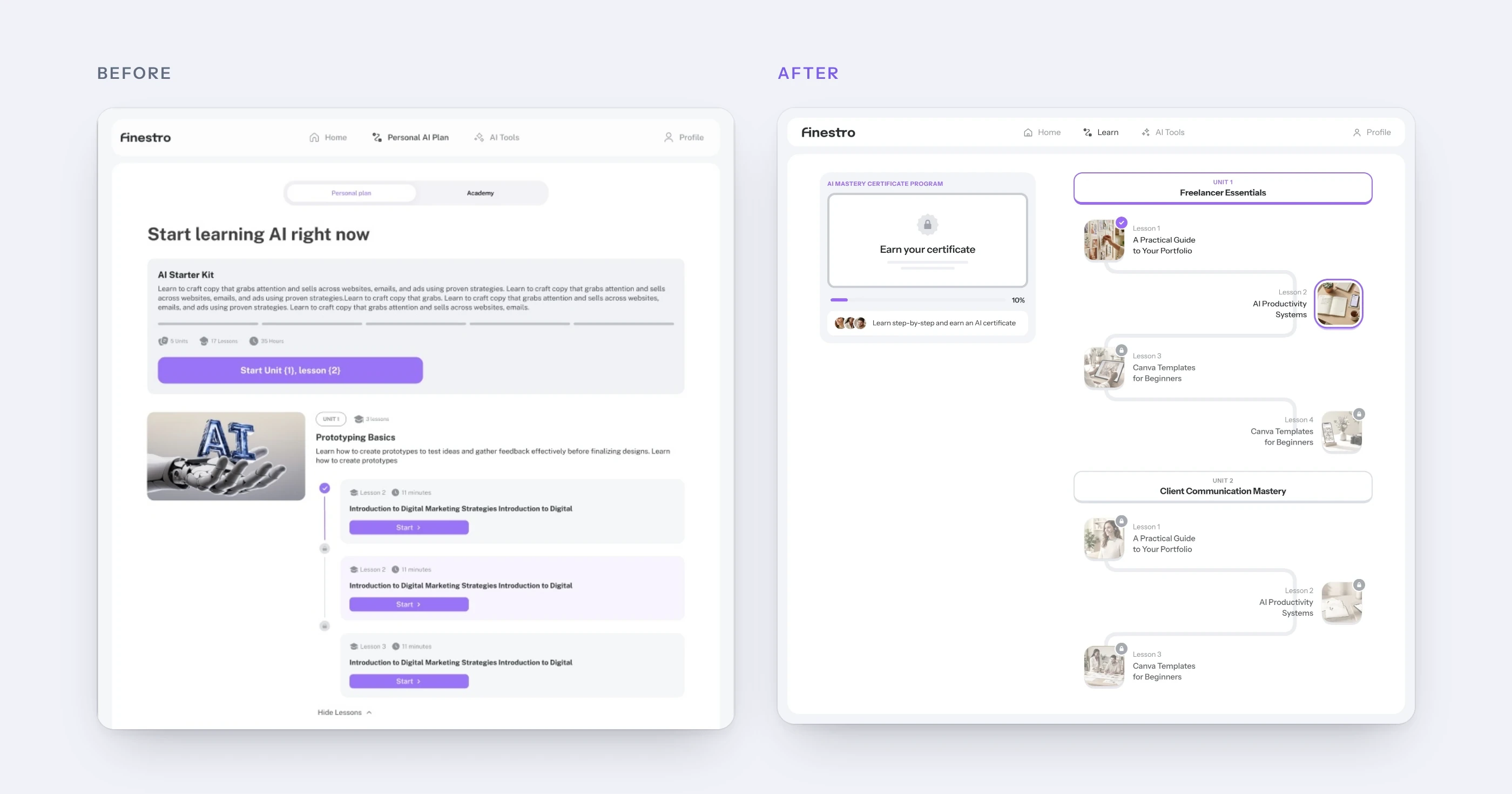
The first version of the Personal Plan already had units, lesson locks and progress indicators. But it showed the course as content: a long description, then units as large photo cards, with lessons hidden behind Show Lessons. The page got long, and the current lesson and finished work were easy to miss.
The goal was simple: more users coming back to the plan and finishing lessons. Before changing the screen, I looked into what actually keeps people learning.
Hypothesis: make continuing feel like a small step
Learners saw what the course contains, but not how far they had come or where to continue.
If learners see what they’ve finished, where to continue and what they’re working towards, they are more likely to complete another lesson and return to the plan.
Stage 2 · Research
Research first: what keeps users learning
The redesign came out of research: how other learning apps show progress, what studies say about game mechanics in learning, and which mechanics would have the biggest impact on our product. The top one became the new design.
- Competitors
Competitor analysis
How Tixu, JobEscape, Coursiv, Duolingo and Mimo show a plan, a path and progress.
PlansPathsProgress - Studies
Research on motivation
What studies say about gamification, goal gradient and started progress.
Meta-analysisGoal gradientEndowed progress - Ranking
Mechanics by impact
Eight game mechanics ranked by their effect on completion and retention.
8 mechanicsImpactPriorities - Design
The learning path
The top mechanic, the progress map, turned into the new plan.
PathLesson statesCertificate
Step 1Competitor analysis
I collected how Tixu, JobEscape, Coursiv and Duolingo build their onboarding and learning plans, and how Duolingo, Mimo and other apps turn a course into a path.
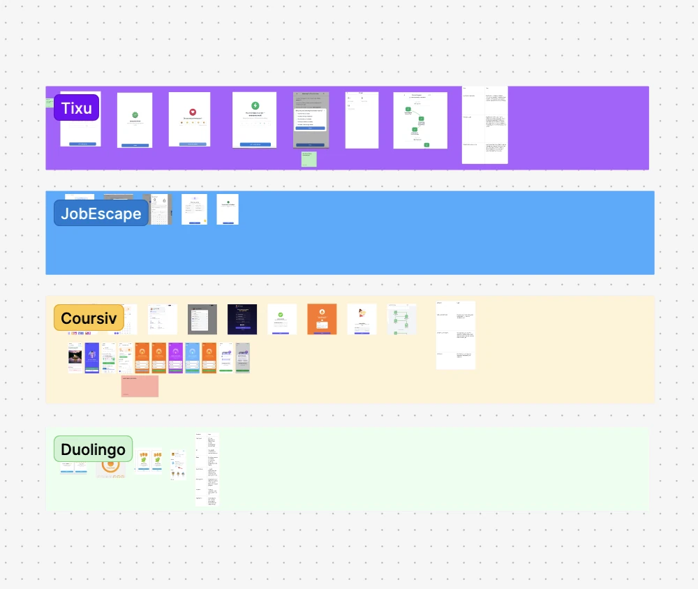
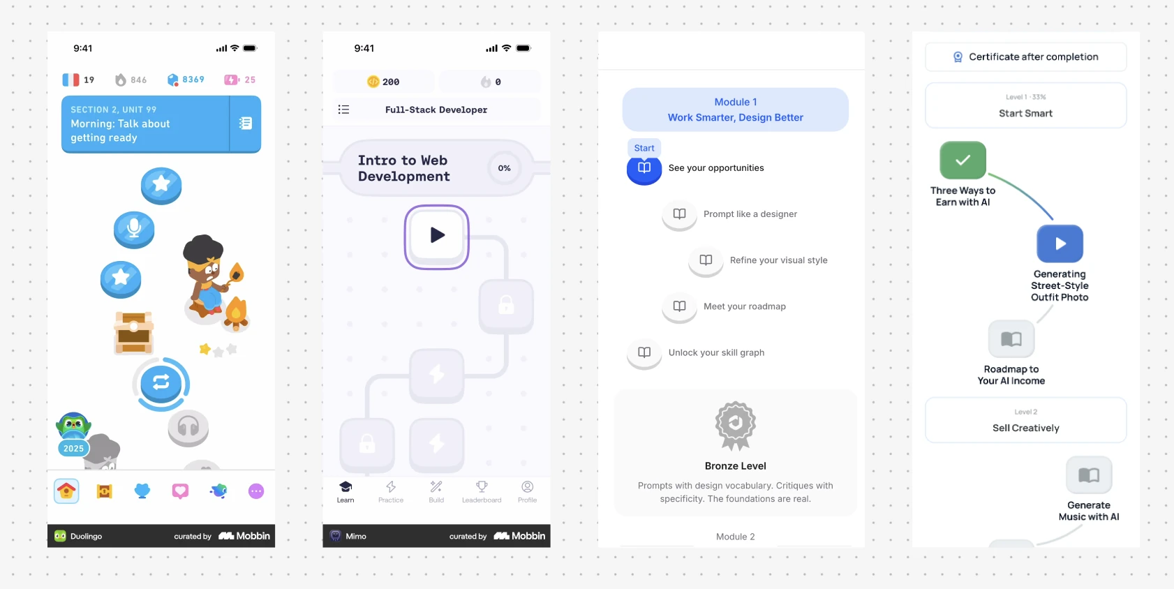
What they have in common: lessons as steps on one path, locked steps ahead, units as milestones and a reward at the end.
Step 2What studies say, in simple words
- Gamification helps learning
A 2020 meta-analysis of gamified learning found positive effects on what people learn, their motivation and their behavior. The effects are small to medium, so the details of the design matter.
- The closer the goal, the faster we go
The goal-gradient effect: in a café loyalty study, customers bought coffee more often the closer they were to a free one.
- Started feels worth finishing
The endowed progress effect: car wash customers whose card already showed some progress were more likely to complete it.
- One clear next step
Duolingo replaced its tree of skills with a single path, so learners always know what to do next.
Sources: Sailer & Homner, The gamification of learning: a meta-analysis (2020); Kivetz, Urminsky & Zheng, The goal-gradient hypothesis resurrected (2006); Nunes & Drèze, The endowed progress effect (2006); Duolingo, the new home screen design (2022).
Step 3Mechanics ranked by impact
Based on the research, I ranked gamification mechanics by how strongly they affect the product: course completion, retention and motivation. For each one I noted why it got its place and how to use it in Finestro.
| # | Mechanic | Why this rank | Strongest impact on | How to use it |
|---|---|---|---|---|
| 1 | Progress map This redesign | Shows the user the whole path: where they are now, what they have already done and what comes next. | Course completion, onboarding completion, motivation | Bring a full course map into the plan: modules, lessons and locked/unlocked stages. |
| 2 | Daily missions | Best answers the question “what should I do now?” | Repeat usage, task completion, retention | Show 1–3 actions for today on Home: a lesson, practice, a quiz, a review. |
| 3 | Feedback loops | Helps the user understand the result of an action and feel learning progress. | Learning quality, confidence, task completion | After a task, show not just “right/wrong” but an explanation and the next step. |
| 4 | Challenges | Turns learning into a short goal with a deadline. | Retention, completion, motivation | A 7-day challenge, a module challenge, “close 5 tasks this week”. |
| 5 | Rewards | Reinforces useful behavior right after the action. | Completion, regularity, motivation | Give XP, an unlock or a badge for meaningful actions: a lesson, practice, a checkpoint. |
| 6 | Achievement system | Builds a long-term sense of growth and accumulated progress. | Long-term motivation, retention | Achievements for milestones: the first lesson, 3 days in a row, a finished module. |
| 7 | Leaderboards | Strongly motivate active users, but can demotivate beginners. | Engagement, learning time, repeat actions | Add later: a weekly league for users at a similar level. |
| 8 | Social comparison | Can boost motivation, but needs careful framing. | Engagement, returning, challenge participation | Start with “your progress vs last week”, not “you are behind others”. |
The progress map came first: it shows the whole path, where the user is now and what comes next. This redesign is built around it, with a certificate as the goal at the end.
Stage 3 · New design
From a list of units to a path of lessons
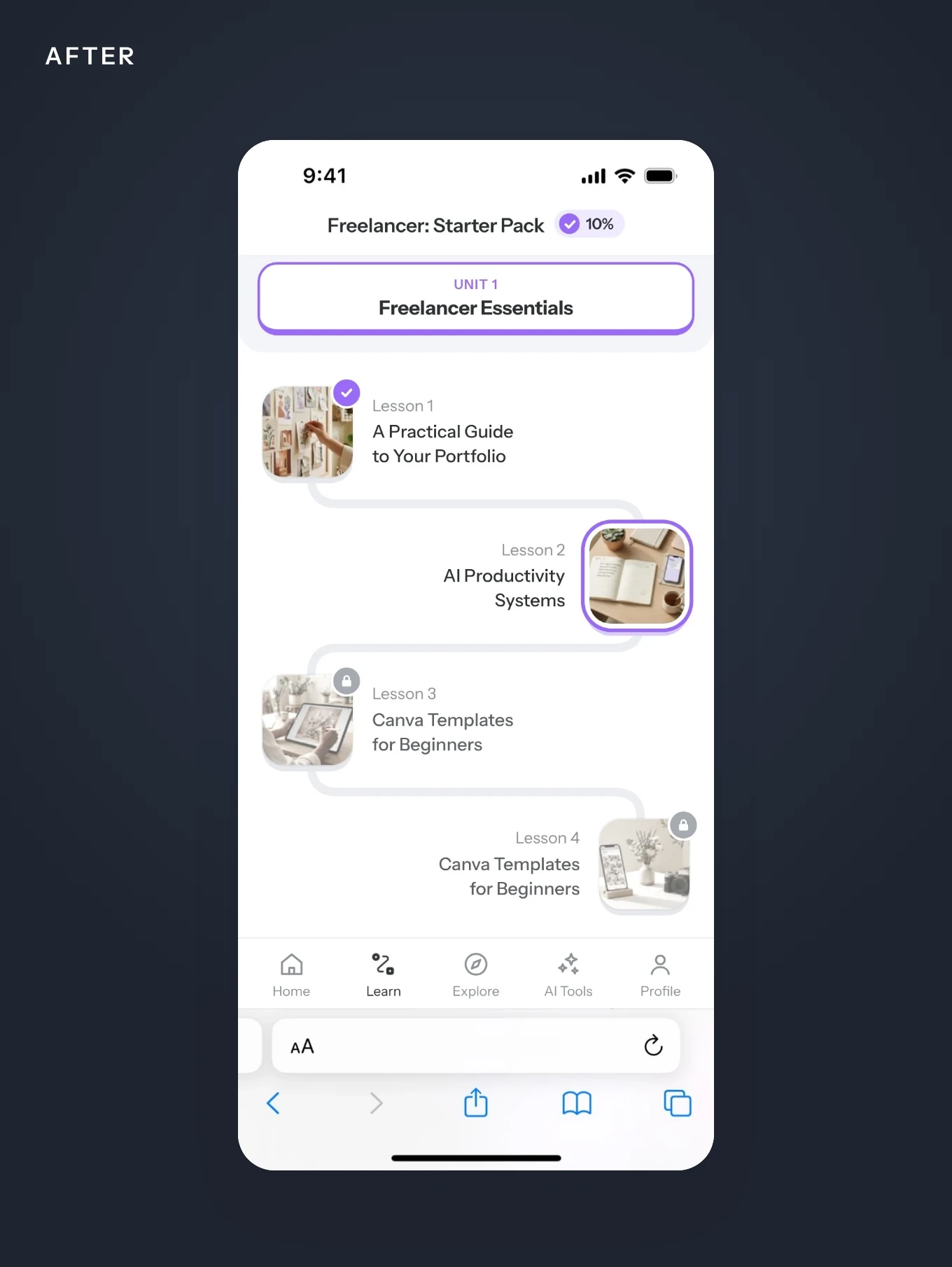
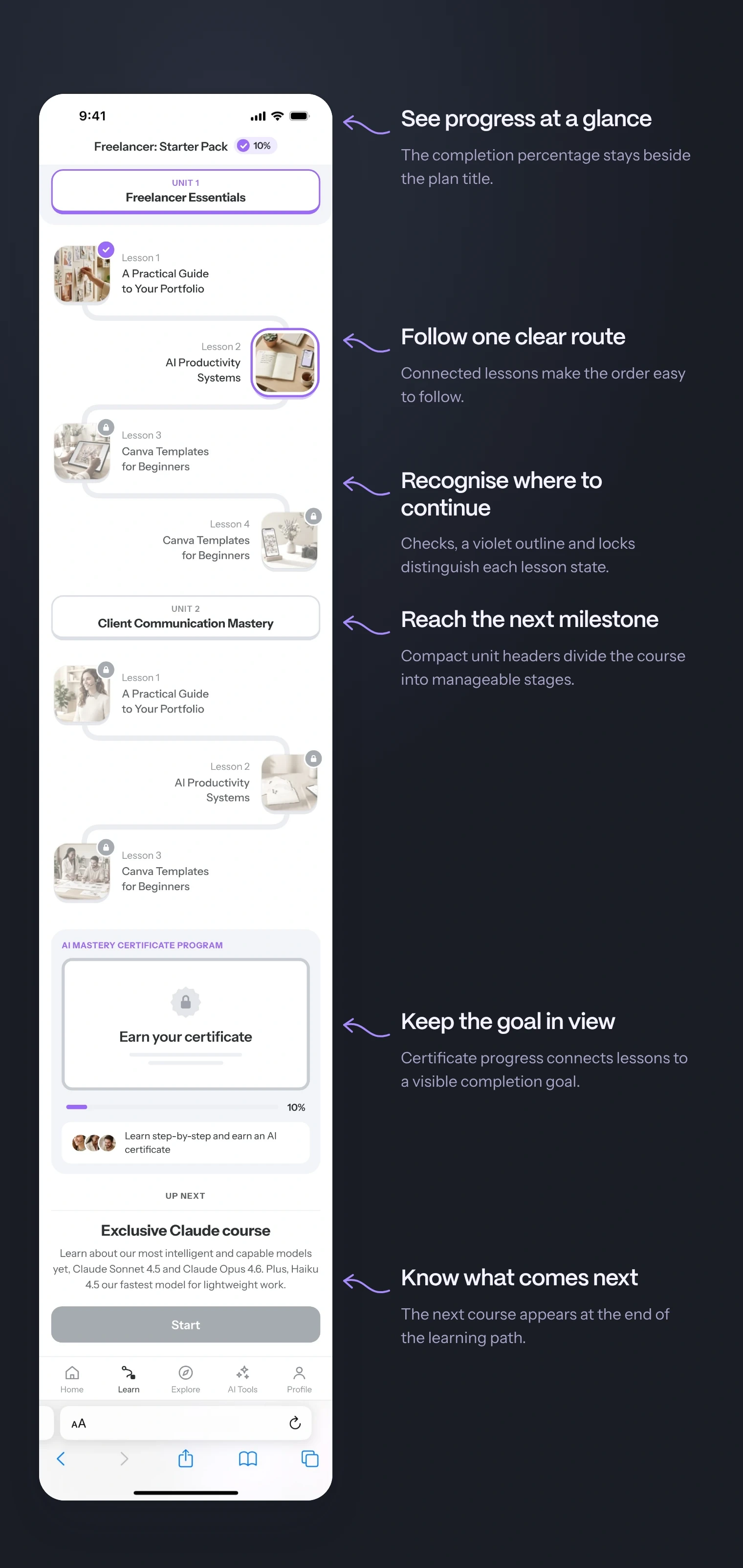
Lessons became steps on one path, units became milestones, and a certificate became the goal at the end.
- 01
Progress in the header
A percentage beside the plan title shows how much of the plan is complete, so learners always have a reference point.
Intended behaviourSee how far you’ve come.
- 02
Lesson path and unit milestones
Lessons sit on one connected path, grouped by compact unit headers. Each unit is an intermediate milestone within the course.
Intended behaviourFind the next lesson and understand where it fits.
- 03
Distinct lesson states
A check marks finished lessons, a violet outline highlights the current one, and muted covers with locks show what comes later.
Intended behaviourRecognise finished work and the next available step.
- 04
Next course preview
“Up next” introduces the next course at the end of the path. Its disabled Start button separates a future option from the lesson available now.
Intended behaviourDiscover the next course while finishing this one.
The path: one lesson after another
What I did
- Lessons sit on one winding path, like levels in a game
- Each lesson has a clear state: done with a check, current with a highlight, next ones locked
- Progress is shown next to the course name
- Units work as milestones with their own headers
- Every lesson has its own cover, so the path is easy to scan
- The same path works on mobile and desktop
Staying on track while scrolling
What I did
- Tapping a unit header opens a bottom sheet with what the unit covers
- A floating card keeps the current lesson one tap away
- At the end of the path, Up next shows the following course
The video walks through the new plan: a clear place to continue, unit details in a bottom sheet, a floating action that keeps the current lesson within reach, a progress bar towards the certificate and the next course at the end of the plan.
A certificate as the goal
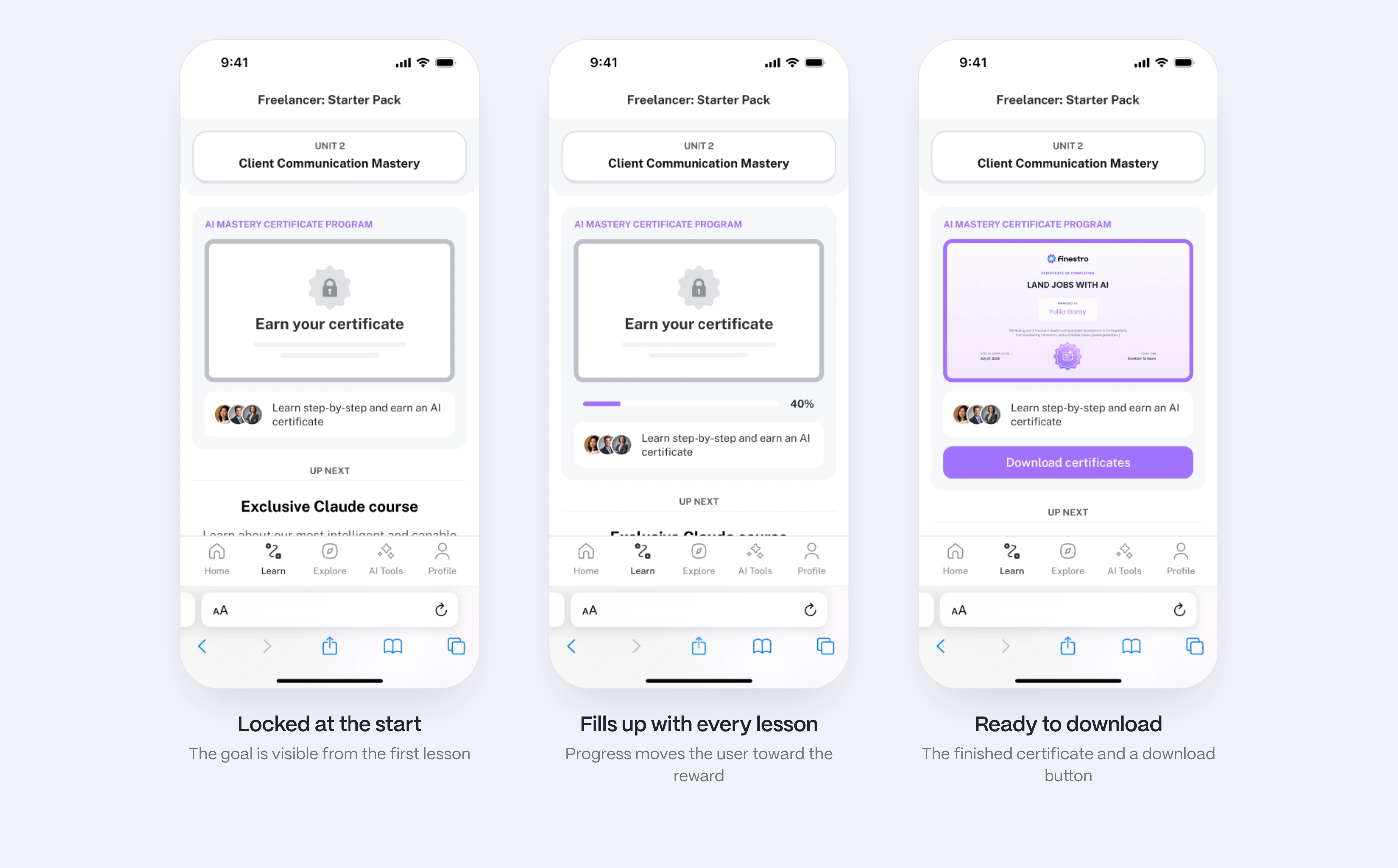
A visible reward at the end gives the path a destination. The AI Mastery Certificate Program card starts locked, fills up with progress and turns into a ready certificate with a download button.
- Locked: Earn your certificate
- In progress: a progress bar with the percentage
- Done: the certificate and a download button
- On desktop the card sits next to the path; on mobile it appears inside the path
Results
More users kept learning
After the gamified plan was released, retention and lesson completion rose by 23%. The course content stayed the same; what changed was how the plan shows the way forward and the progress made.
- +23%
retention and lesson completion after the release
- #1
mechanic from the ranking, the progress map, at the core of the redesign
What I would measure next
- Plan to lesson
How often opening the plan leads to starting a lesson.
- Completion and return
Lesson completion and return visits, tracked separately.
- The role of the reward
The path alone compared with the path plus the certificate.
Summary
Research showed where to start. A path made the plan easier to continue.
- Competitors, studies and a ranking of mechanics before the first screen
- One clear next step and visible progress instead of a list to explore
- A reward at the end that grows with every lesson