

Case study
Funnel Growth
A set of monetization experiments on the marketing funnels of a subscription learning product: an upsell redesign first, then separate mechanics across the funnel, each with its own hypothesis and result.
My role
Product & Monetization Designer
Methods
Screen audit / Hypotheses / A/B tests / UI redesign
Focus metrics
- Upsell take rate
- Revenue per user
Experiment 1 · Upsell
Upsell redesign: a bundle people understand
Right after the main purchase, the funnel offers an add-on: a bundle of an AI learning assistant and a side-hustle course, or one of them on its own. The original screen was designed before I joined. I unified it into a quick, clear design to test against it.
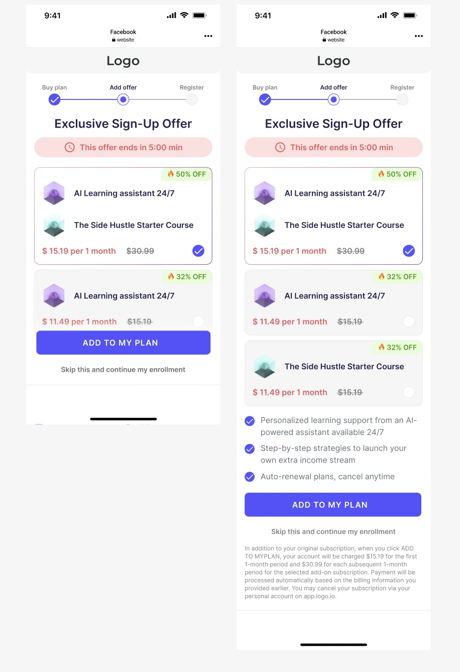
- The bundle showed only product names; what they do sat below the fold
- The same products repeated as separate cards, so options were hard to compare
- A red timer and red prices read as a warning; the button covered the next card
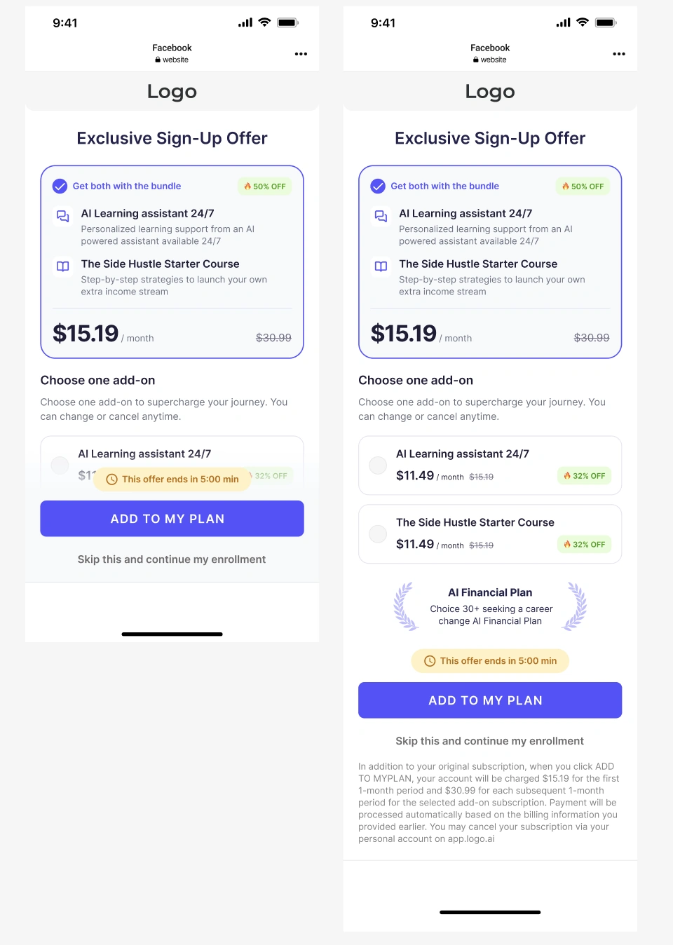
- Each product in the bundle has a one-line description and one large price
- Single add-ons sit below as a clear second choice
- Calm dark prices, and the timer next to the button where the decision is made
Users couldn’t quickly see what the bundle contains, how it differs from a single add-on and what it costs.
If the bundle explains each product and leads the screen, with single add-ons as a secondary choice, calmer pricing and the deadline next to the button, more users will add the offer.
The redesign outperformed the original in an A/B test on upsell take rate and revenue per user, and became the upsell screen for all funnels.
Experiment 2 · Scratch card
Scratch card redesign: a reveal that leads to checkout
The funnel already had a scratch card that reveals a discount. Redesigning it was my initiative: my hypothesis was that a better execution of the same mechanic could give the funnel a boost. I redesigned it in two iterations. The first version showed no difference in the funnel. The second, shown below as After, gave a significant lift in conversion to payment and ARPU.
The team also asked for a card that can be reused for local events and holidays, so the text and image on the scratched area are configurable without new design work.
Version 2 significantly increased conversion to payment and ARPU, and the configurable card is reused for localized events and holidays.
Beyond these experiments
More to come
The upsell and the scratch card are only two of many experiments on these funnels. I built more than 15 funnels from scratch and designed over 40 unique screens, each built around its own hypothesis and tested in production. More of them will be added to this case soon.
- 40+
unique funnel screens designed
- 15+
funnels built from scratch