




Case study
Finly: an iOS app for personal finance
Finly is an iOS personal finance app designed to make everyday money management simpler and more personal. It brings expense tracking, budgets, savings goals and financial insights into one flexible experience.
My role
Product Designer responsible for UX flows, wireframes, UI design, interactive prototypes and the design system.
Methods
Competitive analysis / PRD / User flow and CJM / Wireframes / Prototyping
Main goals
- A clear picture of balance and spending
- Personal control over wallets and categories
- Budgets and goals users can follow
Stage 1 · Design challenges
Defining the key design challenges
The main challenge was to make financial management flexible without making the experience complicated. I explored existing finance apps, identified opportunities to simplify common interactions, and translated these insights into product requirements and user flows.
These six challenges shaped the key design decisions throughout the project.
Design challenges and solutions
Challenge
01Making the app flexible enough to support different financial habits and preferences.
Solution
Interface customisation for the functions each person uses, so the app fits their needs. For example, a different colour scheme for every wallet.
Challenge
02Making frequently used actions easy to find and access.
Solution
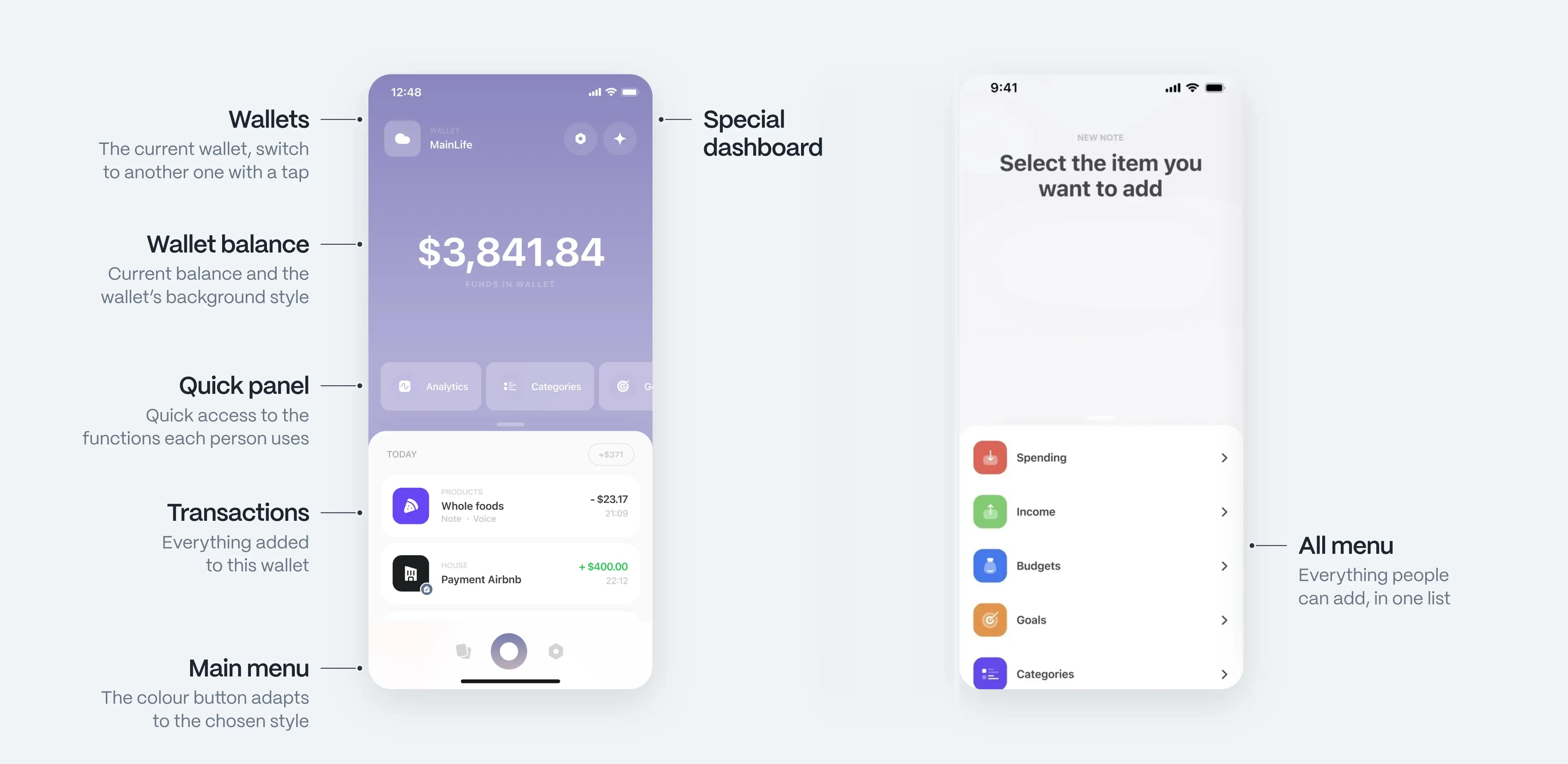
Simpler navigation and a cleaner main screen. The quick access panel in the navbar takes users straight to the functions they use most.
Challenge
03Allowing users to save useful context alongside individual transactions.
Solution
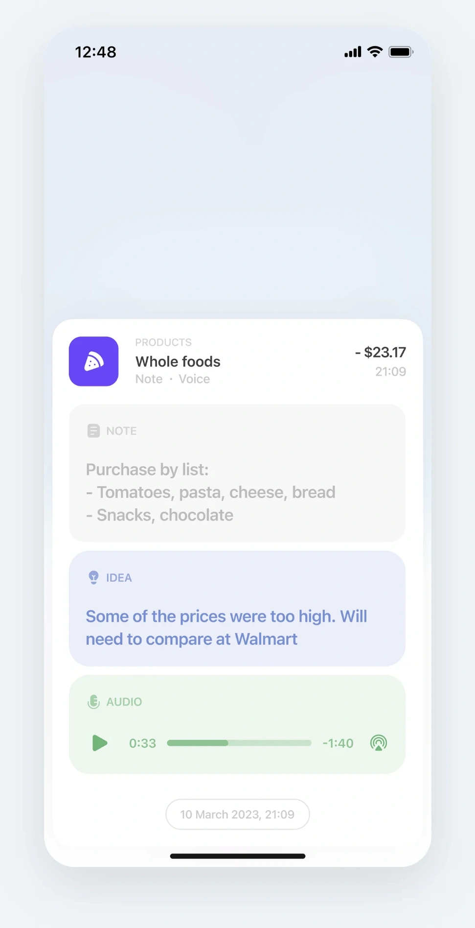
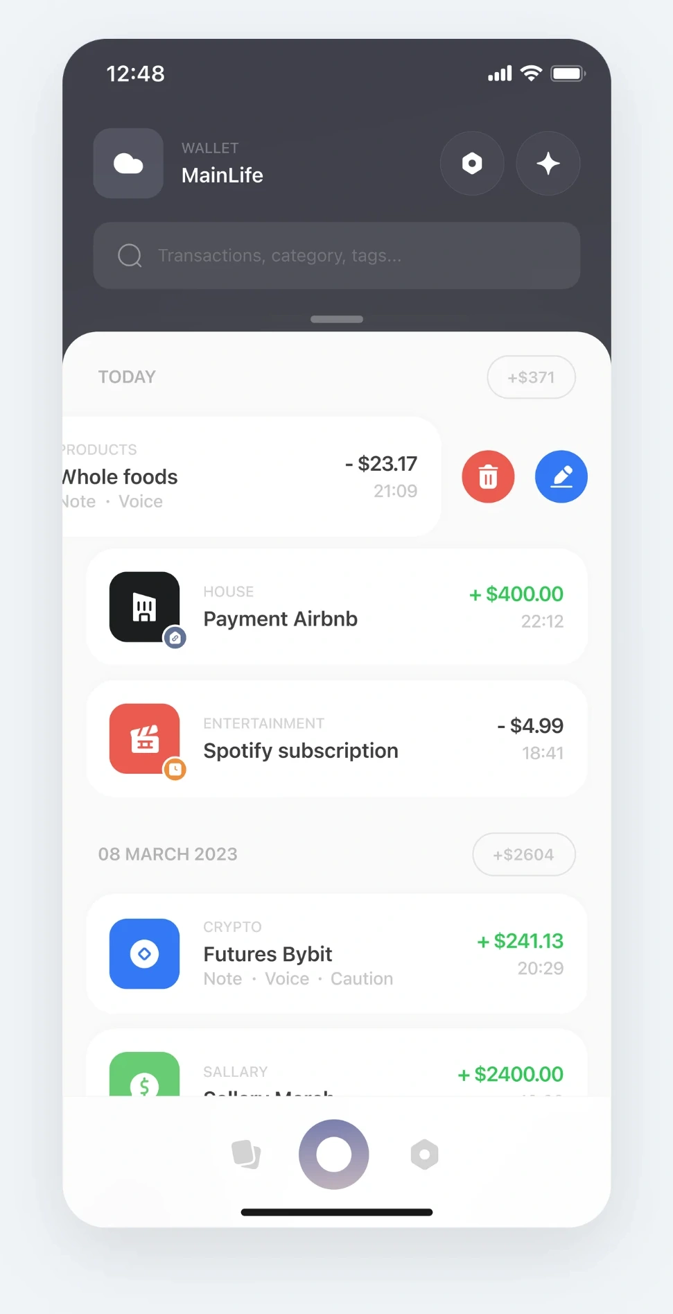
Each transaction is its own record where users keep what matters to them: a note, an idea, a warning or even a voice message.
Challenge
04Keeping the main screen focused without overwhelming users with data.
Solution
The dashboard became a secondary screen. The main page puts key information first: wallet balance, transactions and quick access to important features.
Challenge
05Making financial analytics relevant and customisable.
Solution
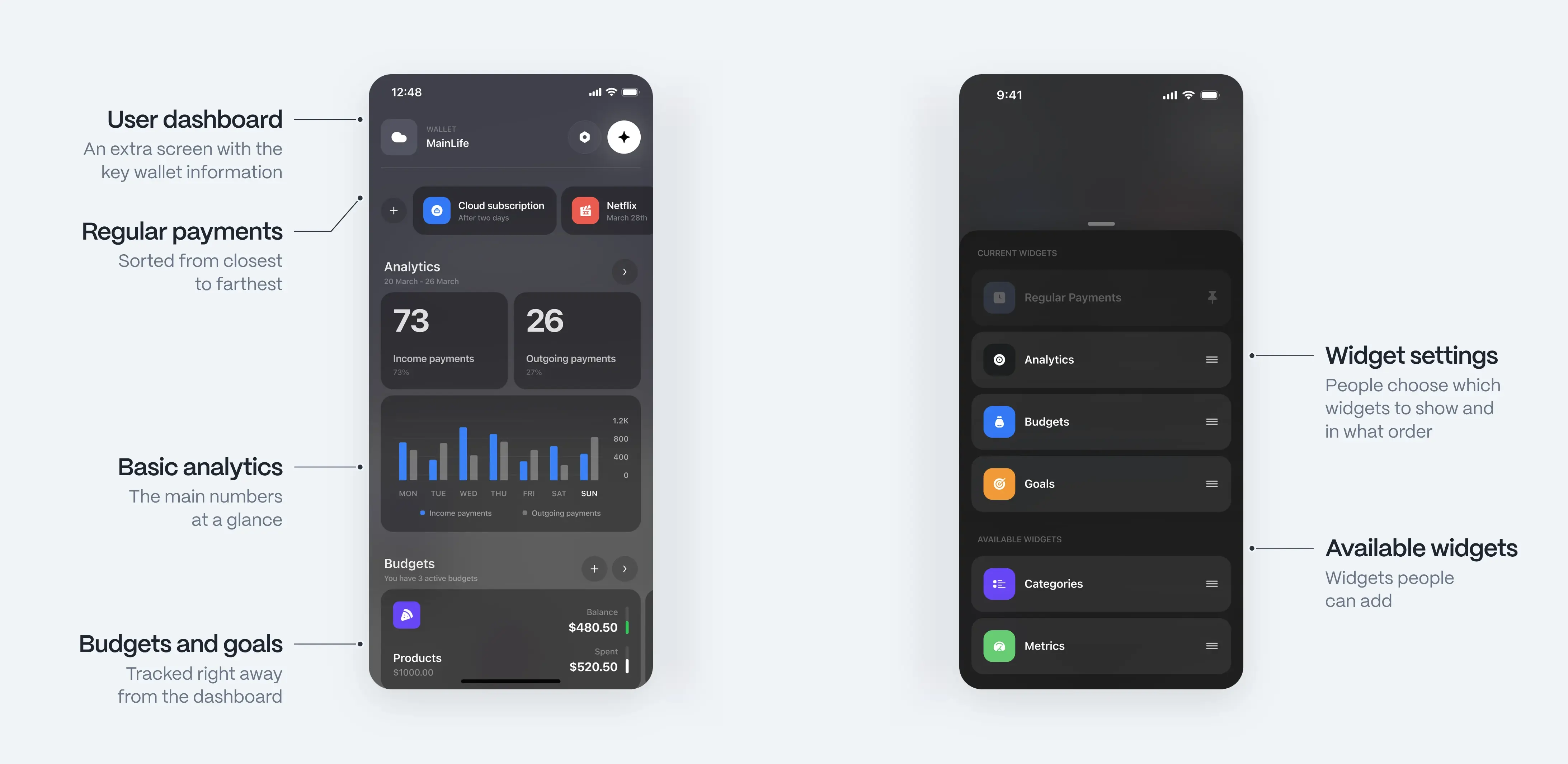
People choose which analytics to show and hide the rest, so everyone sees what they want.
Challenge
06Helping users maintain accurate expense records over time.
Solution
Reminders to log expenses, set up for each wallet separately or for the whole app.
Stage 2 · User flow
Making complex features easy to navigate
Finly combines multiple financial tools, so keeping navigation simple was a priority. I structured the app around a central home screen, with quick access to transactions, wallets, budgets, goals and analytics.
The flow was designed to make everyday actions easy to reach while keeping more advanced features organised in dedicated sections.
Key screens as low-fidelity wireframes
Stage 3 · Design development
Designing the core experience
I focused on five key areas of the experience, from personalised onboarding to everyday transactions, budgets and analytics. Each feature was designed to make financial management simpler, clearer and more flexible.
A personalised start without the complexity
Challenge 01
The onboarding experience needed to introduce Finly’s key features while helping users personalise the app from the start.
Instead of a long walkthrough, I designed a card-based flow with optional setup steps for wallets, categories and goals. Users could skip any step and start with default settings, making it easier to explore the app without committing to a full setup.
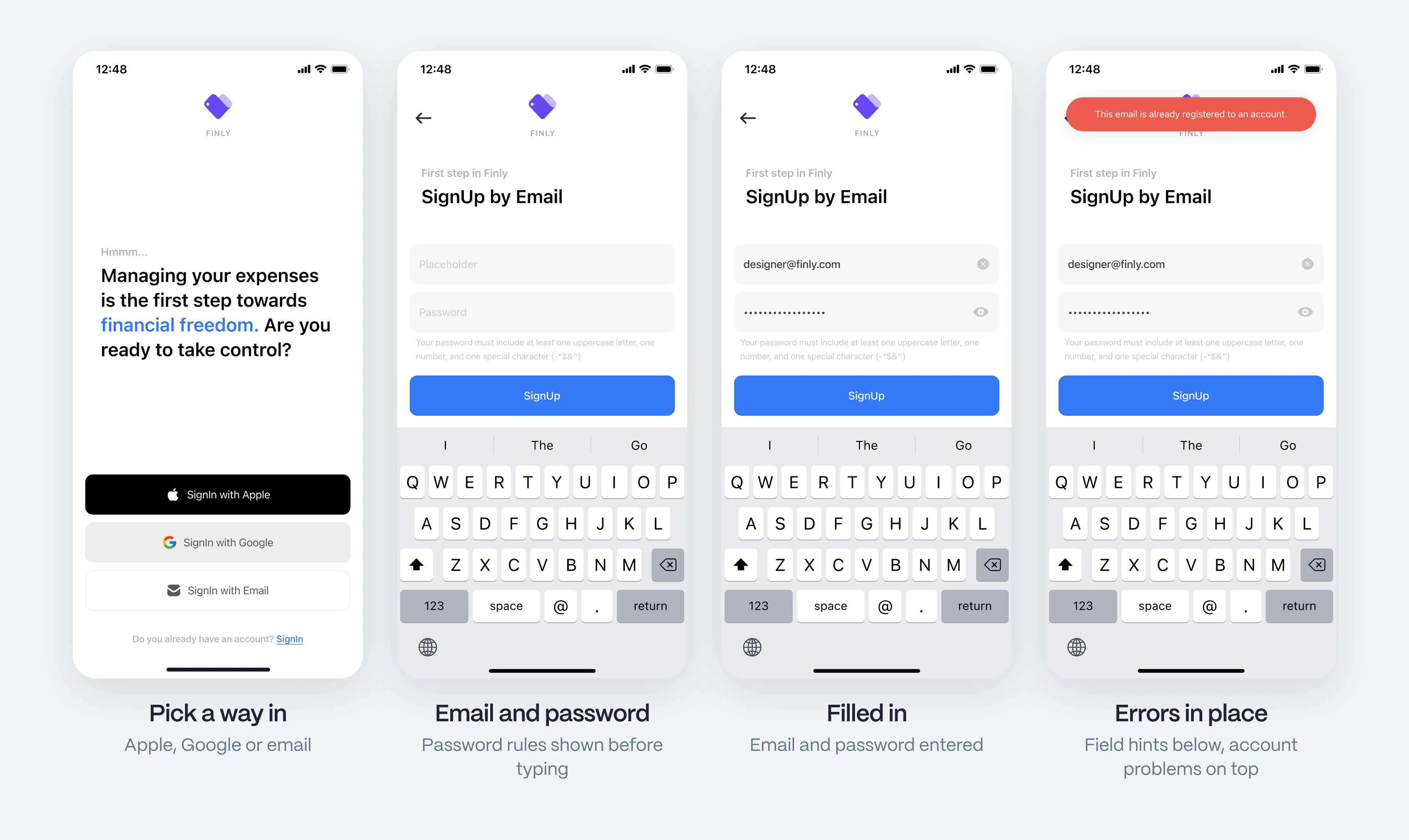
Sign-up before the first run: a choice of Apple, Google or email, then a form that shows the password rules up front and explains errors where they happen.
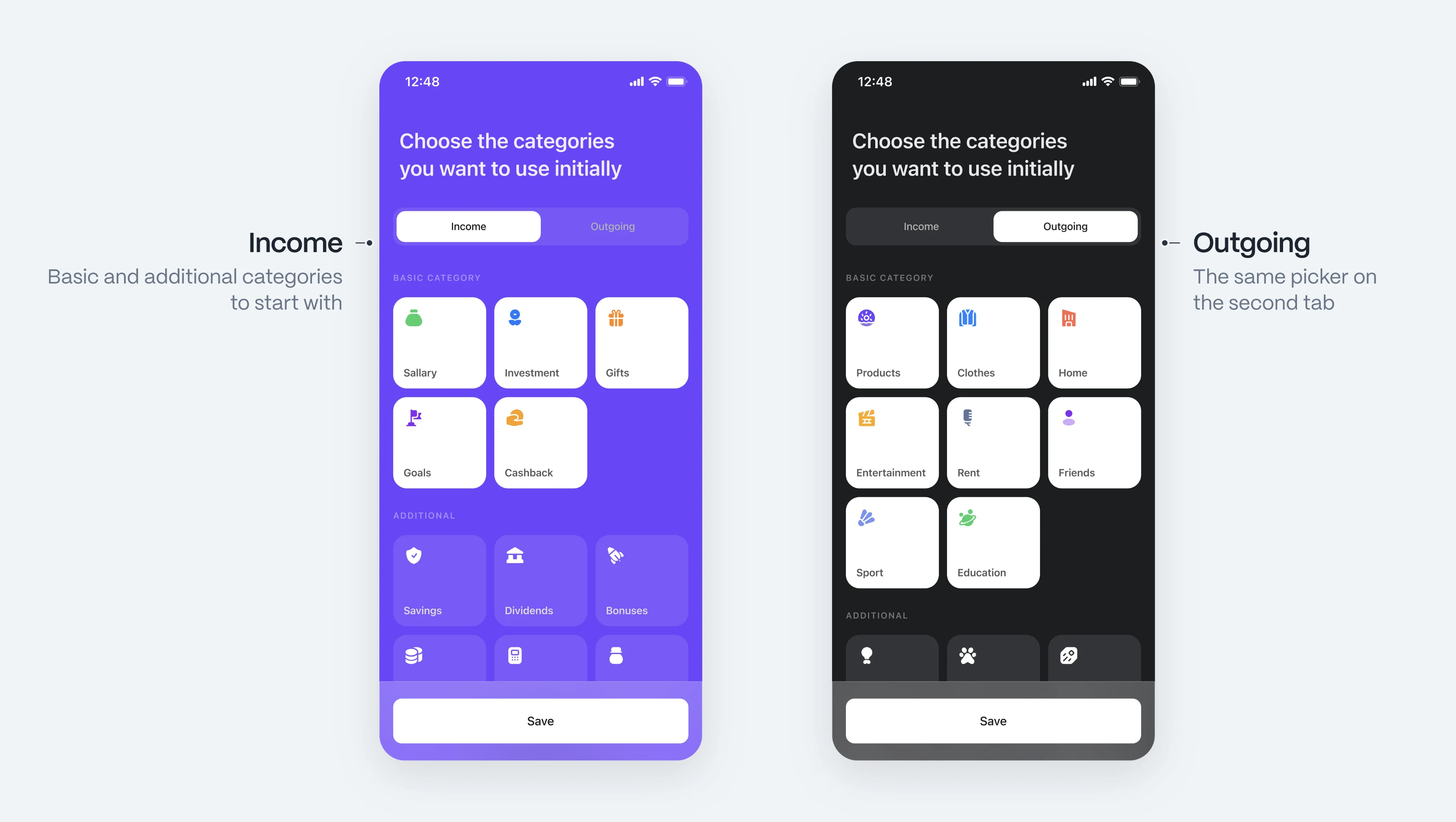
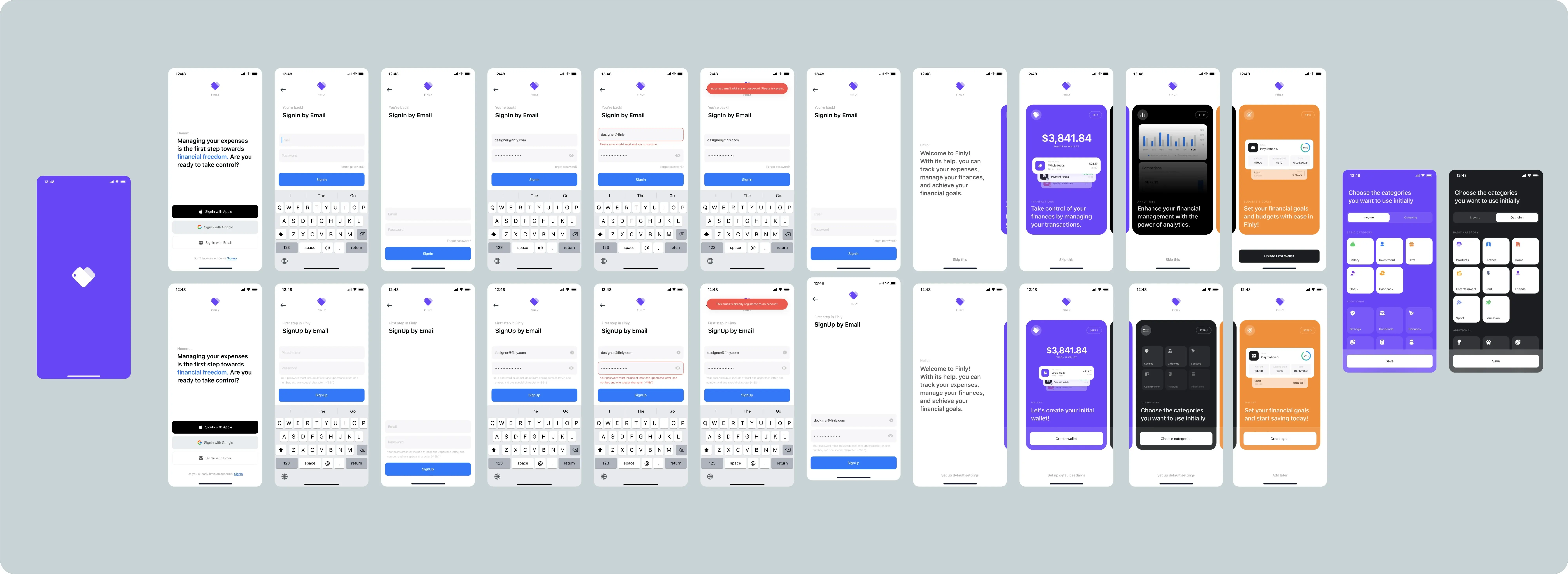
The same flow in Figma: sign-in and sign-up with every state, then the onboarding cards and the category picker.
Main page: balance first, dashboard second
Challenges 02 and 04
The main screen needed to give users a clear overview of their finances without overwhelming them with information.
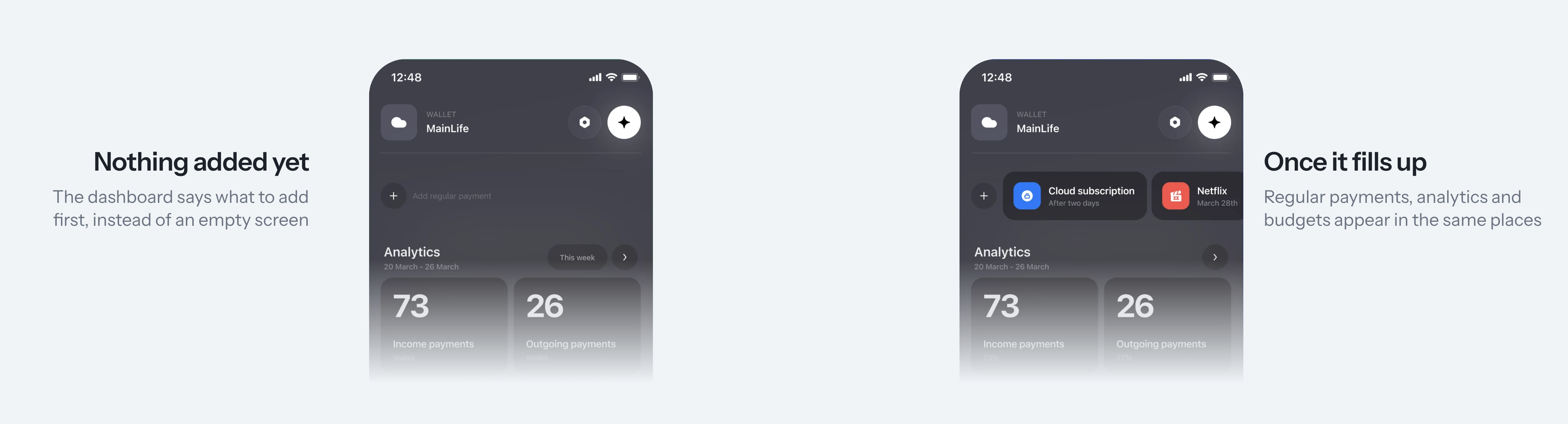
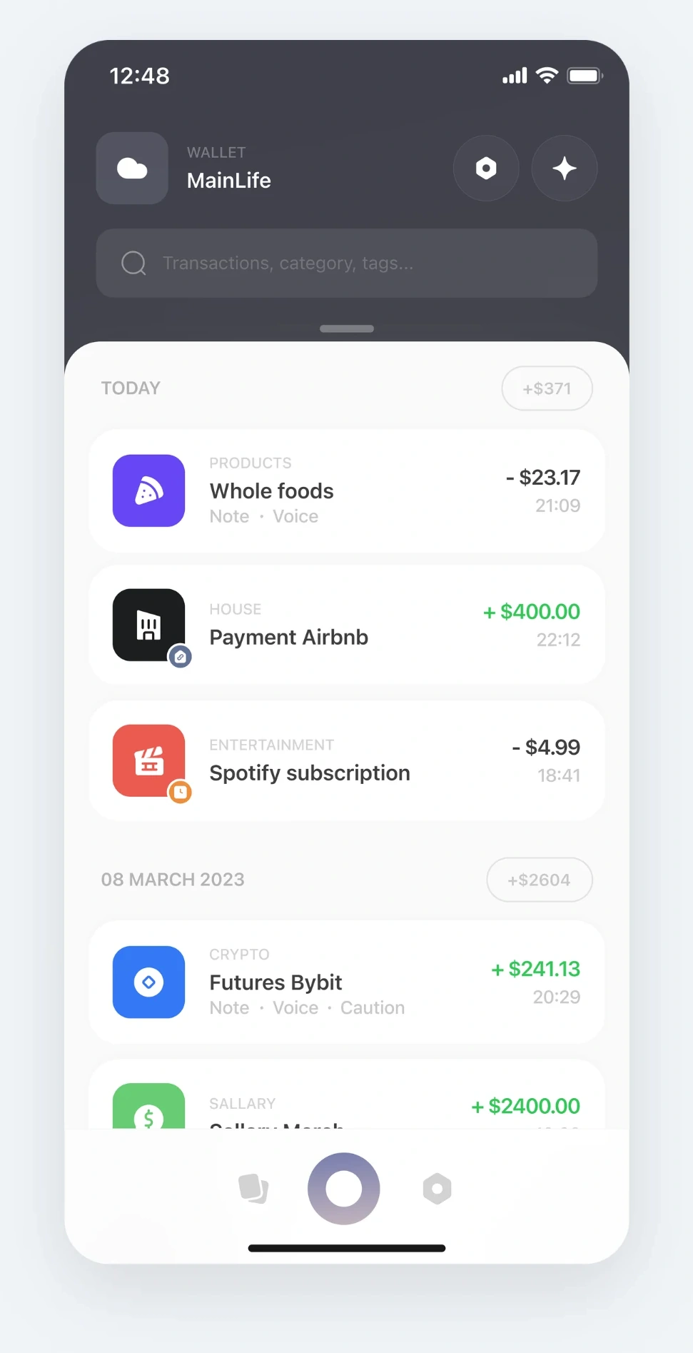
I prioritised the current wallet, available balance and recent transactions, keeping frequently used actions within easy reach. More detailed information, including analytics, budgets and recurring payments, was moved to a separate, customisable dashboard.
This approach keeps everyday money management simple while giving users access to deeper insights when they need them.
Transactions that keep their context
Challenges 03 and 06
Transactions are more useful when they capture more than just an amount and category.
I designed a flexible transaction system that supports notes, ideas, warnings and voice recordings. Users can also search transactions, reuse templates and set reminders to keep their records up to date.
The goal was to make expense tracking more useful without adding complexity to everyday actions.
Making financial progress easy to follow
Main goal 03
Budgets and savings goals should be easy to create, understand and track.
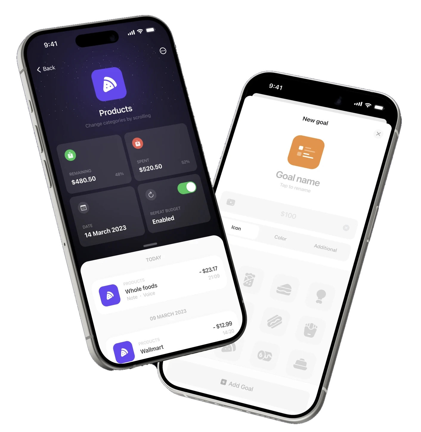
I designed dedicated pages that bring progress, remaining amounts and related transactions together. To simplify goal creation, I prioritised essential inputs such as the name and target amount, while keeping additional settings optional.
Budgets & goals
A page for every budget and goal
Each budget or goal has its own page, so users see progress, totals and every related transaction in one place.
- Budget page. Remaining and spent amounts with the share of the limit, the period and a Repeat budget switch.
- Linked transactions. Everything counted towards this budget, grouped by day.
- New goal. Name and target amount first, then icon, colour and extra settings, saved with Add Goal.
Privacy & security
Lock your wallet
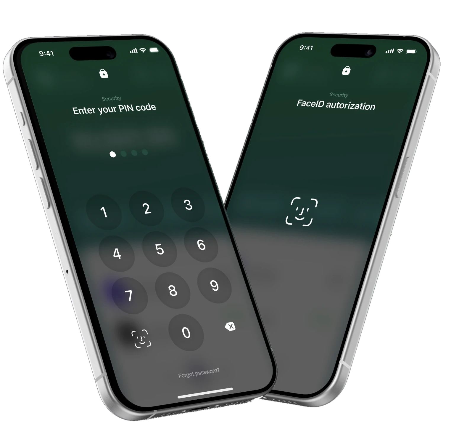
A separate task from budgets: giving users more control over who can see their financial information. Finly can be locked with a PIN code, with Face ID as an option.
- PIN code. Four digits with progress dots; the Face ID key and Forgot password? are right on the keypad.
- Face ID. Opens the app with one look, no code needed.
Financial insights that adapt to each user
Challenge 05
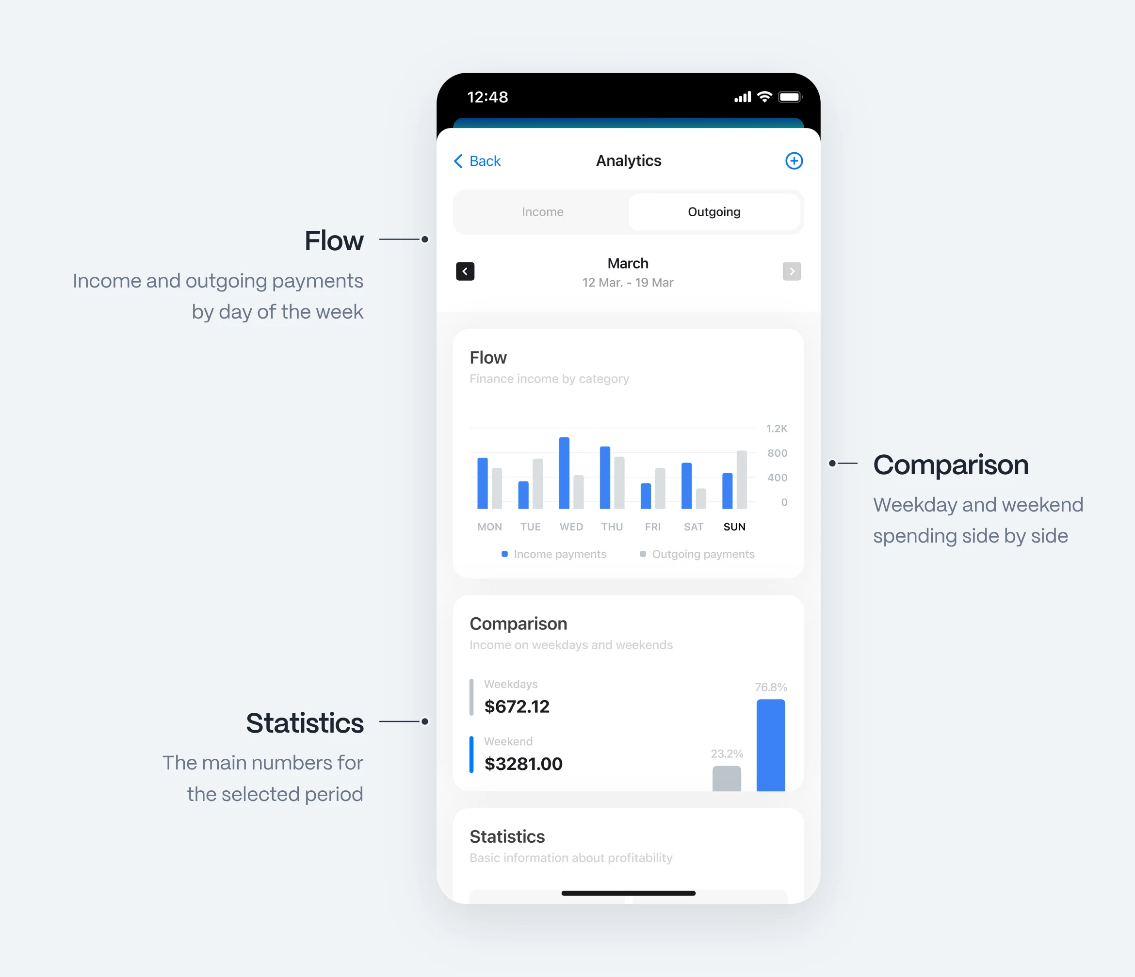
Financial analytics should help users understand their spending patterns without overwhelming them with unnecessary data.
The dashboard keeps only a short analytics widget, and users choose whether to show it. The arrow on that widget opens a detailed page for the wallet, with breakdowns of income and expenses by day of the week and a weekday and weekend comparison.
Stage 4 · Design system
A flexible design system for every wallet
I created a consistent visual system that supports multiple wallet colour schemes and works across light and dark themes.
Reusable components, typography and shared interaction patterns helped keep the interface cohesive while allowing users to personalise their experience.
Wallet colour schemes
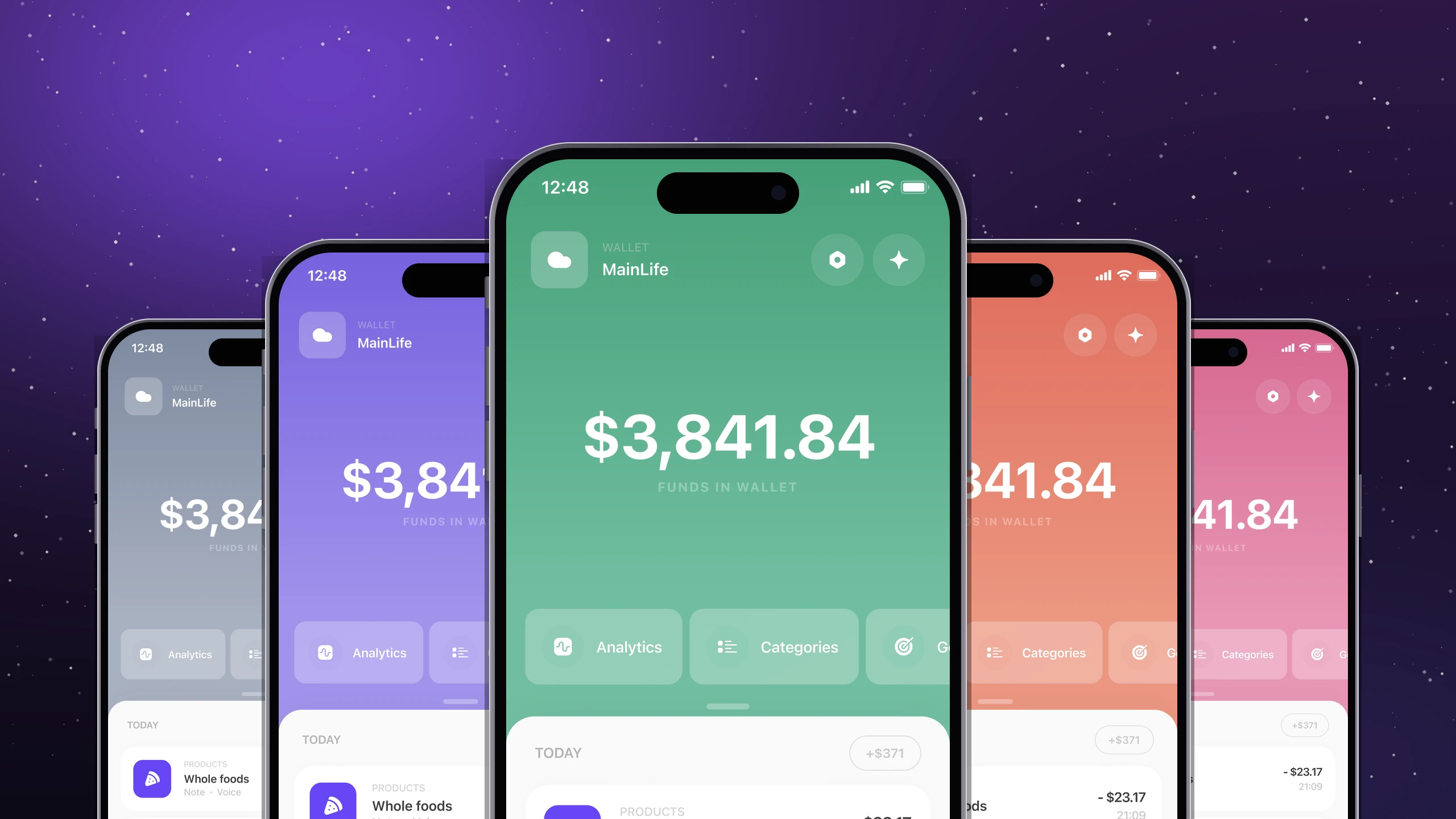
Every wallet gets its own gradient. The balance screen, quick panel and main button take on that colour, so users know which wallet they are in at a glance.
- Lilac
- Mist
- Sky
- Aqua
- Mint
- Coral
- Rose
- Graphite
Main colours
- WhiteScreens and cards
- VioletAccent and icons
- BlackText
- BlueActions and links
Typography
Native iOS type: familiar, legible at any size
- HeadingHeading · Bold
- TitleTitle · Medium
- Body textBody · Regular
- LABELLabel · Caps
Outcome
Design outcome
The project brought together multiple personal finance features into a cohesive iOS app experience, from onboarding and expense tracking to budgets, goals and analytics.
I designed the core user flows, high-fidelity interfaces, interactive prototypes and a reusable design system supporting multiple colour schemes and light and dark themes.
One of the key design challenges was balancing personalisation with simplicity, making advanced features available without overloading everyday interactions.
- 172+
screens in the final design
- 2
themes, light and dark
- 8
wallet colour schemes
Summary
Expense tracking, transaction classification and spending analysis became simpler through a clear interface.
- A clear picture of finances
- Personal control over wallets and categories
- Budgets and goals users can follow