
Case study
Finestro: an EdTech platform for learning AI
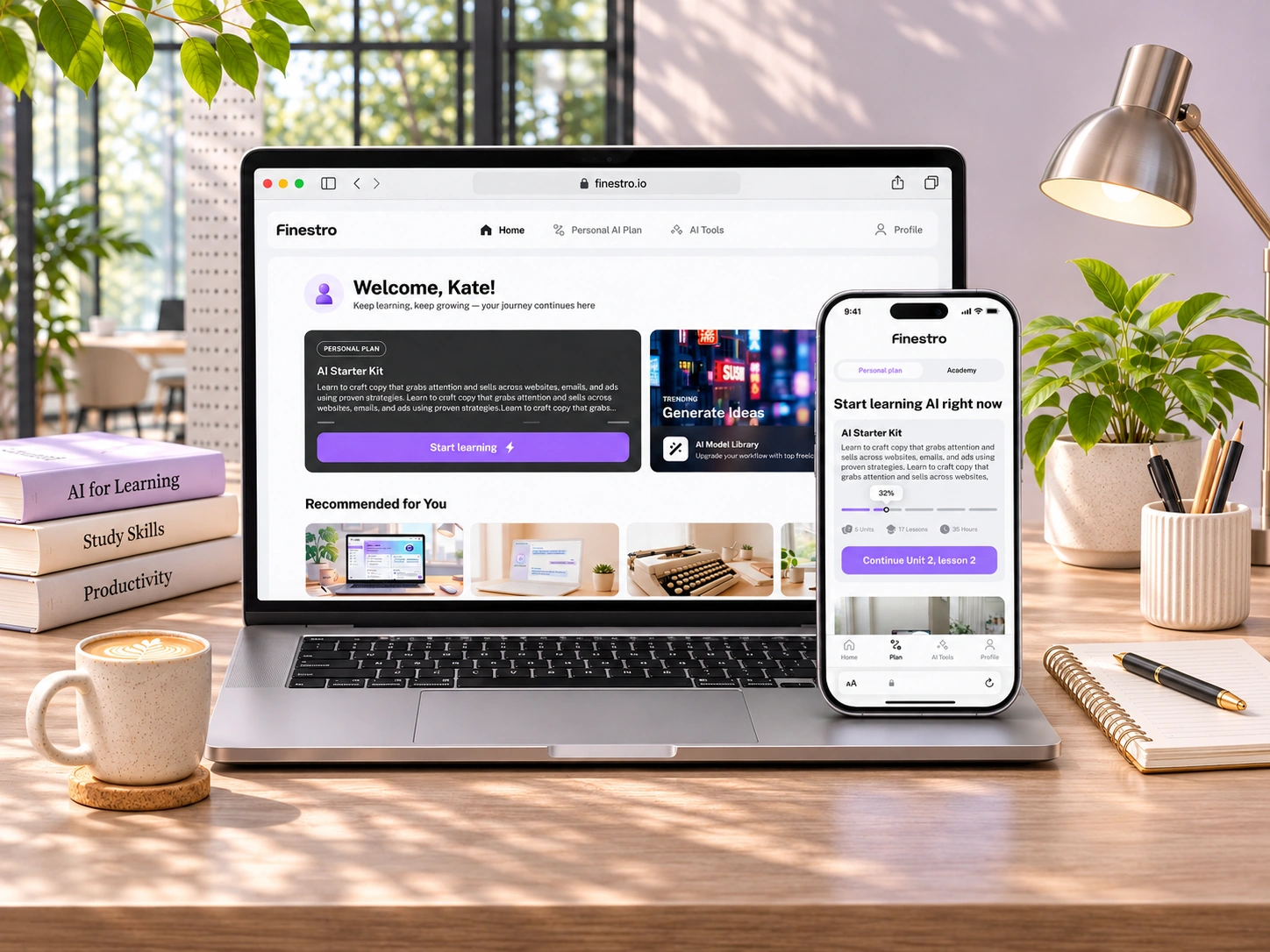
With three weeks and no detailed requirements, I took Finestro from an initial concept to a working MVP as the sole product designer.
My role
Product Designer. I worked with the PM and checked key decisions with the CEO. 3 weeks.
Methods
Competitive analysis / Information architecture / Learning and progress logic / User flows / Responsive UI
Main goals
- Turn messy AI learning into a clear path
- Always show progress and what to do next
- Let people try AI right inside the product
Stage 1 · Research
Understanding what makes AI learning practical and accessible
The brief named the main areas: Home, Personal Plan, AI Tools and Profile. How they should work together was still open, and there were no user interviews before launch. The audience was people in English-speaking markets, mostly 35+, who wanted to understand AI and use it in real life.
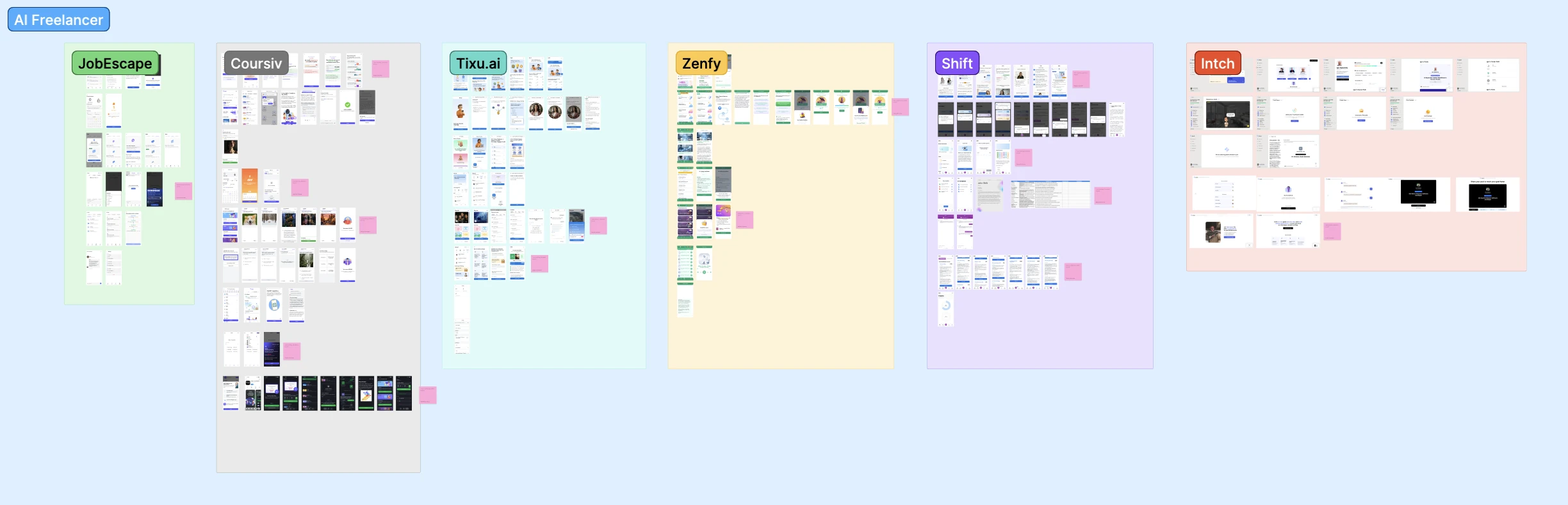
I reviewed six products: JobEscape, Coursiv, Tixu.ai, Zenfy, Shift and Intch. I analyzed how they structure learning paths, present educational content, integrate practical exercises and guide users through the experience.
What I took from the review
- Beyond theory
Practical exercises help users turn knowledge into useful skills.
- Simplicity first
Given the target audience, I prioritized clear navigation, accessible content and straightforward interactions.
- Concrete AI
People get more involved when AI is a set of tools and actions they can try right away.
- Practice inside
JobEscape showed how useful it is to have an AI environment inside the product. That shaped AI Tools.
Stage 2 · Structure
One connected loop: discover, learn, apply
I structured the product around three key actions: discovering relevant content, following a personalized learning path and applying new skills through AI Tools. This connected Home, Personal Plan, Academy, AI Tools and Profile into one consistent experience. Then I defined what happens inside each section: how the plan works, lesson states and progress, task flows and the capabilities of AI Tools.
- 01Discover
Look around and find a place to start.
- 02Learn
Follow a clear path and see your progress.
- 03Apply
Use what you learned on a real task.
Stage 3 · Design development
Five features that move people from a first visit to applying AI
Each feature solves one problem: where to start, how to keep going, how to practise, how to get people to their first lesson, and how to ship all of it in three weeks.
Home and Personal Plan: one clear next step
Without structure, learning AI feels vague and overwhelming. People needed a confident place to start and a sense of order.
What I did
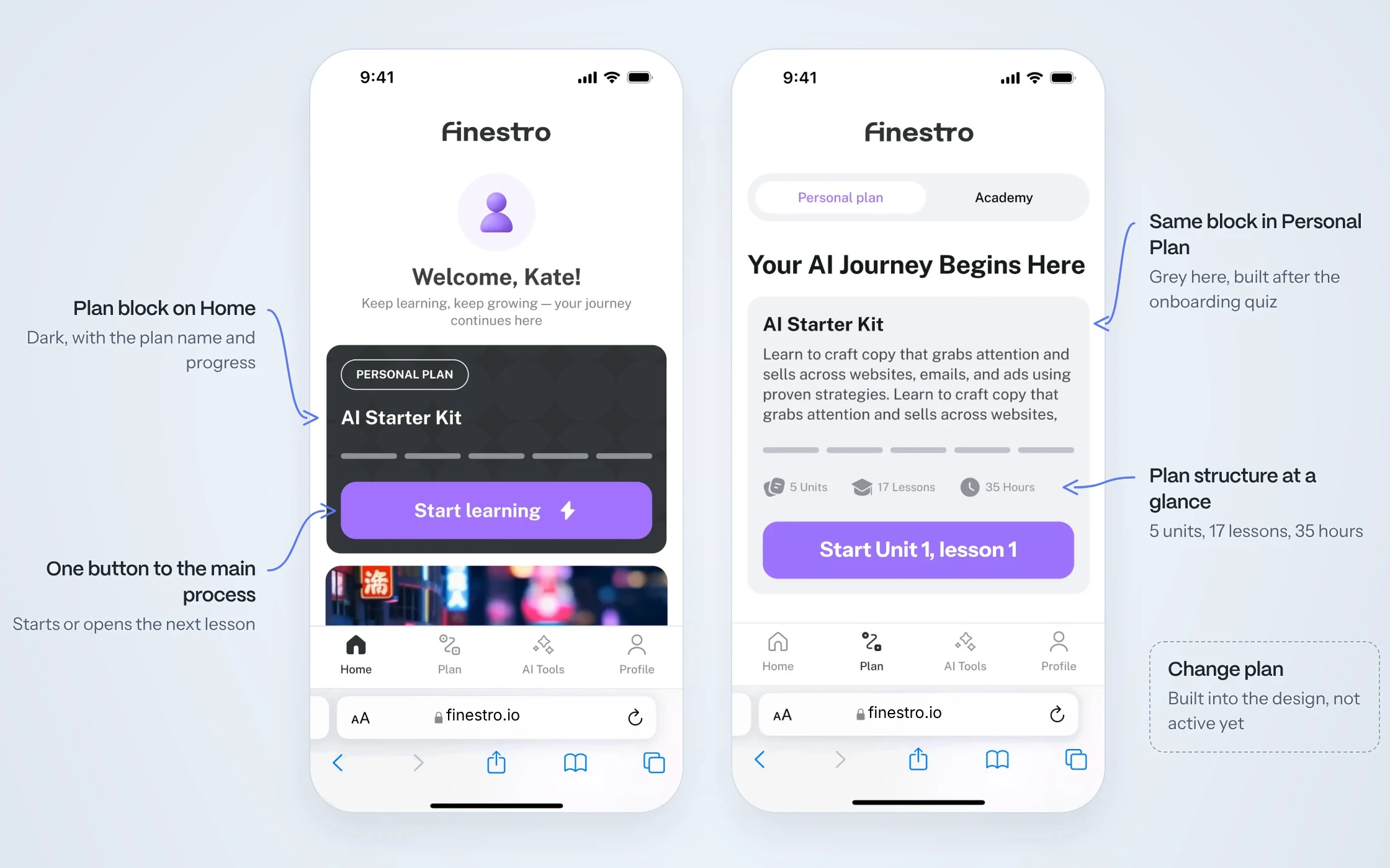
- Home greets people by name and starts with their plan, then shows trending AI tools and Academy courses: recommended ones and the top 10 courses this week
- Personal Plan is built for each person, based on the onboarding quiz
- The plan block shows progress and is the fastest way into learning: one button starts or opens the next lesson
- Changing the plan is designed, but not yet available in the MVP
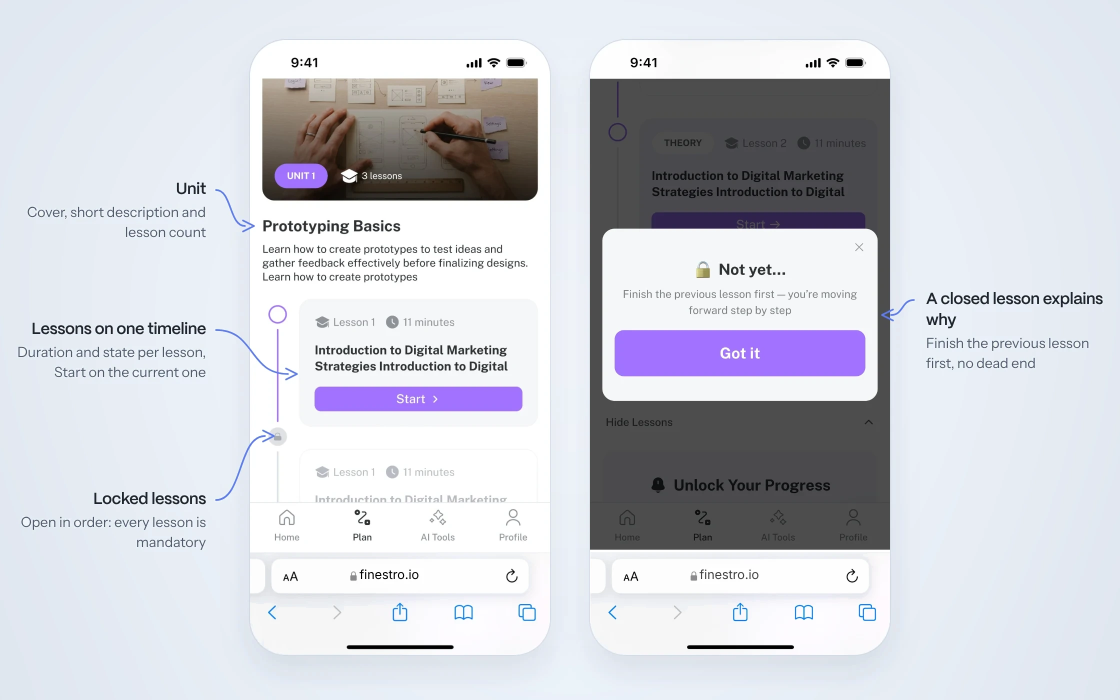
- Each unit lists its lessons on one timeline with duration and status. Lessons in the plan go in order and are mandatory
- Locked lessons explain why they are closed, so users understand their next step
Academy: lessons that lead to practice
AI courses often fail when people understand the ideas but don’t know how to use them. Lessons needed to encourage active learning, not passive reading. Academy is a separate part of the product: extra modules for self-study that are not in the Personal Plan.
What I did
- Short, readable theory with images and pro tips
- Quizzes with instant feedback
- A practical task card that opens the task, or lets people skip it for now
- Every lesson ends with a completion screen and a quick rating
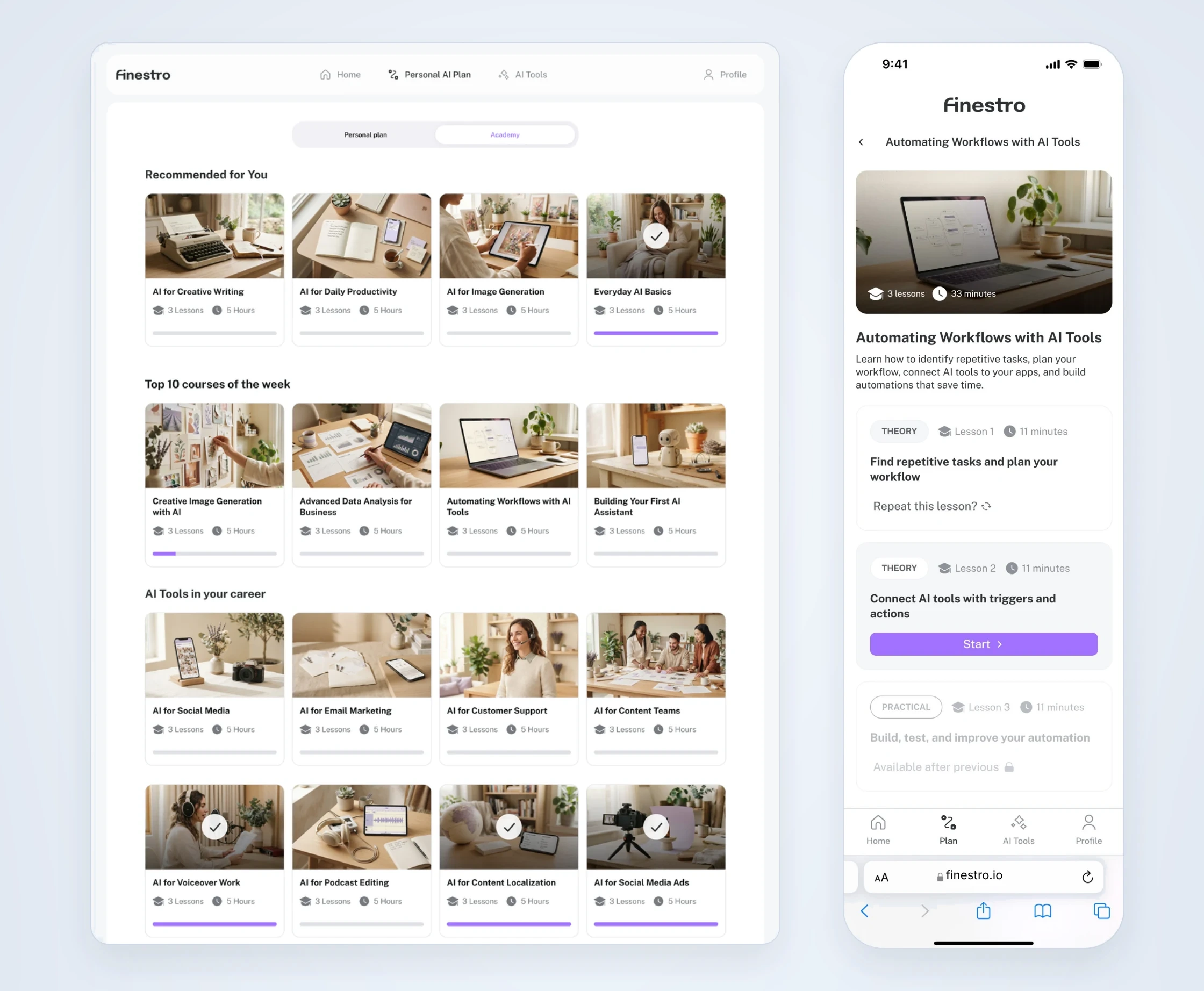
Academy sits next to Personal Plan. Courses are grouped into sections: recommended for the person, the top 10 of the week and topics such as AI Tools in your career. A course card shows the cover, title, number of lessons, hours and progress.
A course page shows the cover, the number of lessons and total time, a short description and the list of lessons. Each lesson is marked Theory or Practical, and practical lessons are mandatory. A finished lesson can be repeated, the current one has a Start button, and the next ones stay locked until the previous one is done.
The video walks through one lesson on mobile, start to finish: theory, a quiz with instant feedback, the practical task card, a task where you drag steps into the right order, and a final rating with an optional comment. Academy has three more types of practical tasks, built from the same components.
I designed reusable lesson components for different types of learning activities. Progress indicators, instant feedback and clear task states help people see where they are and what to do next.
Balancing flexibility and learning outcomes. Competitors often make the practical task mandatory, so people can’t move on until it is done. For the MVP we decided not to complicate things, and the task can be skipped. Next, we want to test a flow where a skipped task reappears at the end of the lesson and has to be completed.
AI Tools: turning learning into real-world practice
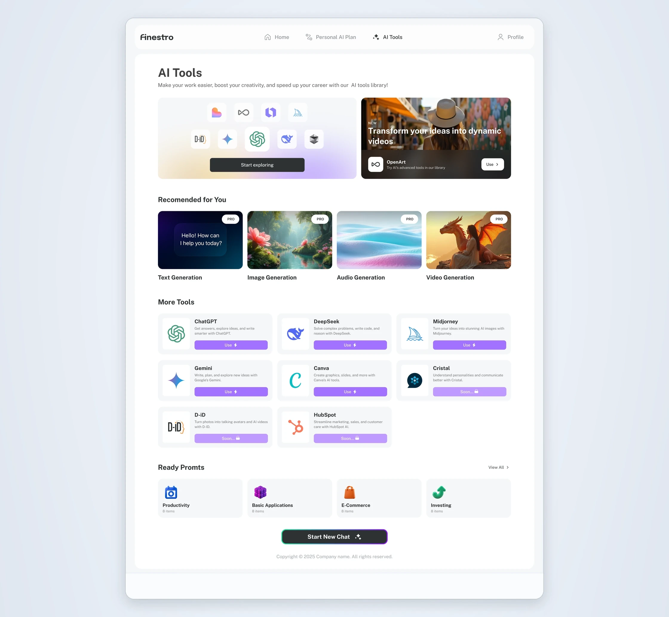
AI Tools opens with a library: a banner with a Start exploring button, then Recommended for You and More Tools, then Ready Prompts and a Start New Chat button. Tools that are not ready yet are marked Soon and stay locked.
Instead of asking people to choose an AI model, I organized Recommended for You around what they want to achieve: text, image, audio or video. This makes the starting point more intuitive, especially for people new to AI. One tap opens a chat with the matching AI, which begins by asking about the goal. More Tools opens a specific tool, and everything works as a chat.
Ready Prompts are grouped by category. The person picks a topic, then a prompt, and the chat opens with that prompt already filled in. One tap on send and the AI answers.
The video shows the flow on mobile: scroll the library, open Ready Prompts, choose the Productivity topic, pick a prompt and send it to get an answer.
Onboarding: a short quiz, a quick tour and a first lesson
To meet the MVP deadline, we prioritized the core learning experience and added onboarding a couple of weeks after launch. The first lesson is where a new person decides whether to keep learning, so onboarding stayed simple and led people there: make the content feel personal, show where everything is, then invite them to start.
What I did
- A short quiz that makes the content personal
- A guided tour of the real product: lessons are here, AI Tools are there
- The last step asks people to tap Lesson 1, so the tour ends with a first action
The video shows the first iteration of onboarding. A short quiz about the goal, learning preferences, AI skills and tools personalizes the experience. After that, the personal plan is created.
Then a guided tour dims the screen, highlights one area at a time and says in a sentence what it is for: the plan, Home, AI Tools and the first lesson. Every step has Skip and Next. The last step highlights the whole first lesson, so one tap on Start opens it.
What the first onboarding iteration changed
A short set of questions about the goal, format, AI skills and tools make the content feel personal from the first minute.
The answers turn into a personal plan, so right after the quiz the person sees a clear next step.
The screen dims and one area is highlighted at a time: the plan, Home, AI Tools and the first lesson.
The last step highlights Lesson 1. One tap on Start opens it, so the tour ends with a real first action.
- First lessonHigher engagement
User engagement in the first lesson went up after the first iteration of onboarding.
- RetentionHigher retention
Retention went up too. The first iteration was made a couple of weeks after launch.
Reusable patterns to ship in three weeks
The MVP had to ship fast, across all sections and screen sizes.
What I did
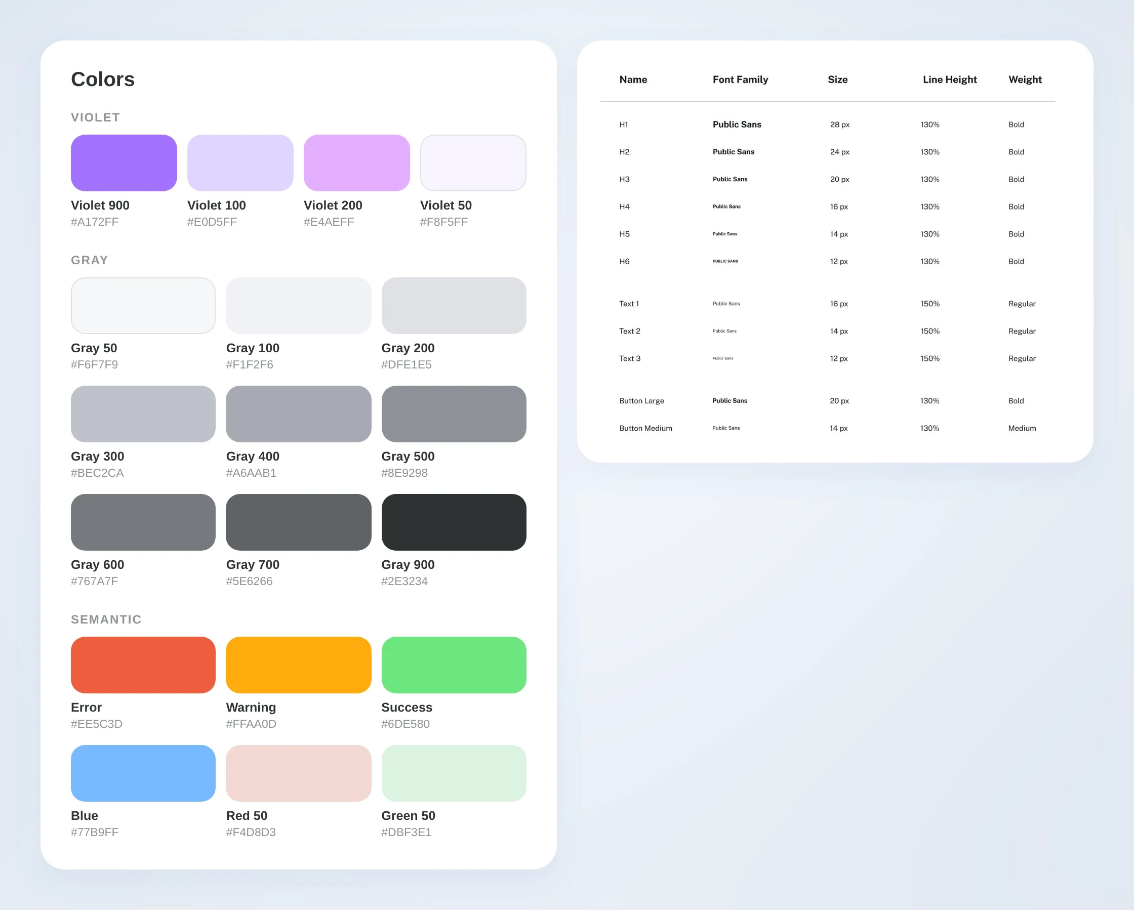
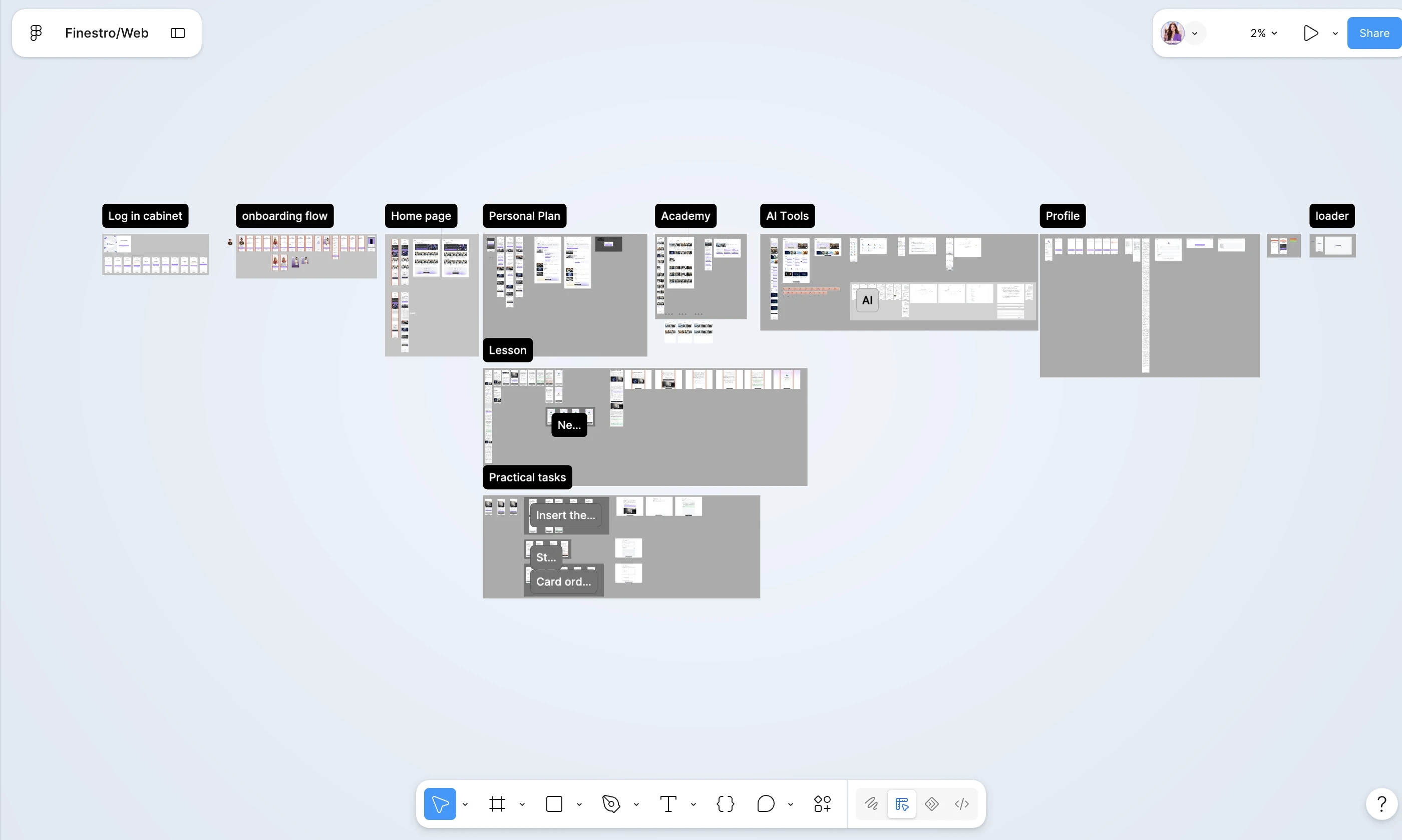
- A reusable UI system for navigation, learning content, interactive tasks and component states, consistent across mobile and desktop
- A violet main colour scale, greys, and clear colours for errors, warnings and success
- I proposed the flows and interface solutions, refined them with the PM and checked them with the CEO
Results
A launched, responsive MVP
From an initial concept to a launched MVP in three weeks. As the sole product designer, I defined the learning experience, structured the key flows and designed a responsive platform that connects personalized learning, practical tasks and AI Tools.
Finestro launched as a working product that people use and that already brings revenue. To keep the first release focused, we postponed some microinteractions, explanatory pop-ups and helper prompts on purpose, and onboarding came after launch. Next, I would explore gamification inside lessons.
Summary
From a rough idea to a launched product that people use and that brings revenue.
- Clarity comes first: a structured path shows people where to start and what to do next
- Progress creates direction: clear lesson states and visible progress make the journey easier to follow
- Practice connects knowledge to action: AI tools inside the product let people apply what they learned